First thank you all for participating!
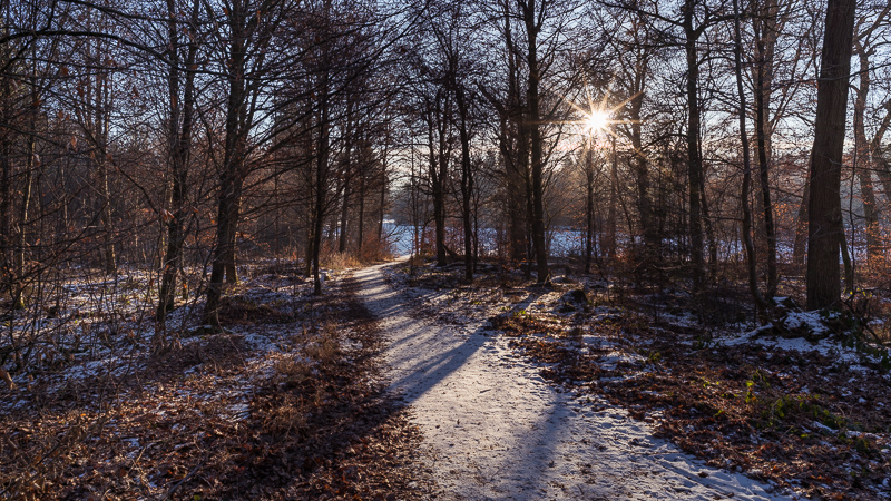
It was really interesting to see all your images. For those who don’t know what we are talking about: We posted a Raw (shot with Loxia 21mm 2.8 on A7rII) on our FB page and asked for your interpretations of this scene:
There is certainly no right or wrong here, the question is always: what mood do you want to convey?
Another really important aspect: you haven’t been there when the shot was taken. So I might connect things to this image that you simply can’t (the smell of the forest, my cold feet, getting up early, watching the sunrise etc.).
So I will discuss your results and show you mine after that. But keep in mind: This is my perspective and other people would have a different perspective. To simplify things I grouped the images.
Black and white edits:
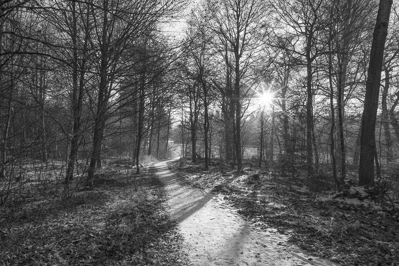
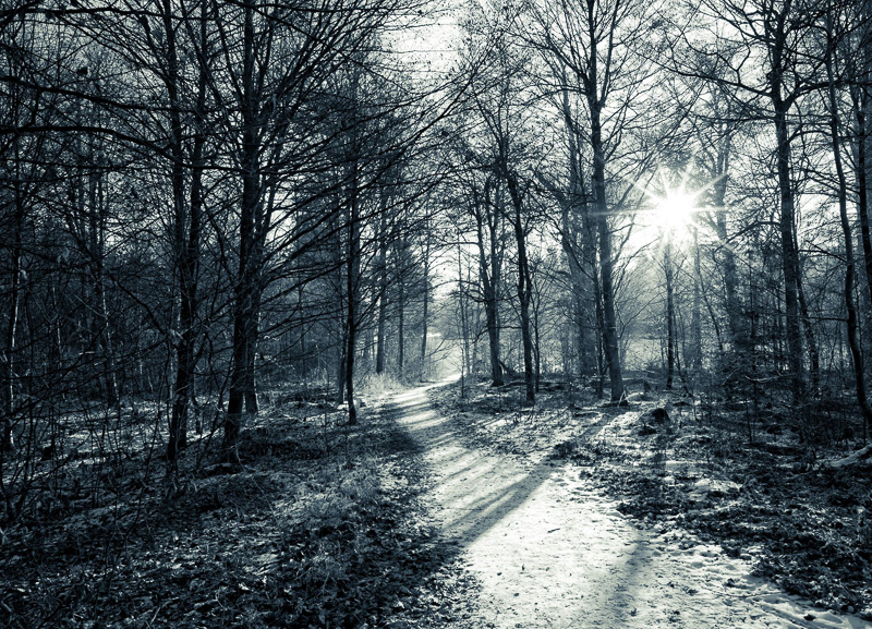
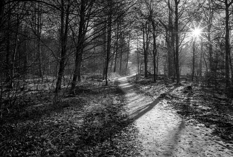
Three participants decided to go for a black and white edit. I was pleasantly surprised to see this but black and white does not really work for me here. I tried different b/w styles in the meantime (low contrast, high contrast, toning), out of these I prefer the third with high contrast. One has to be careful with toning b/w images by the way, I think they polarize quite a bit.
Bright and low contrast edits:

Only two participants decided to go for a bright and low contrast edit. In the first the color of the sky gets almost lost and some parts in the center look a little overexposed. The second it a bit too blue for my taste. I am just missing contrast a bit in these.
Artistic edits:
In this one the shadows were slightly cut and a green tint added. I am not the greatest fan of green for this scene, but such “vintage” edits are quite popular at the moment.
I quite like the colors here, but the vignette is too strong for my taste and the center a little too bright. Especially the strong blue in the corners looks a bit odd to me.
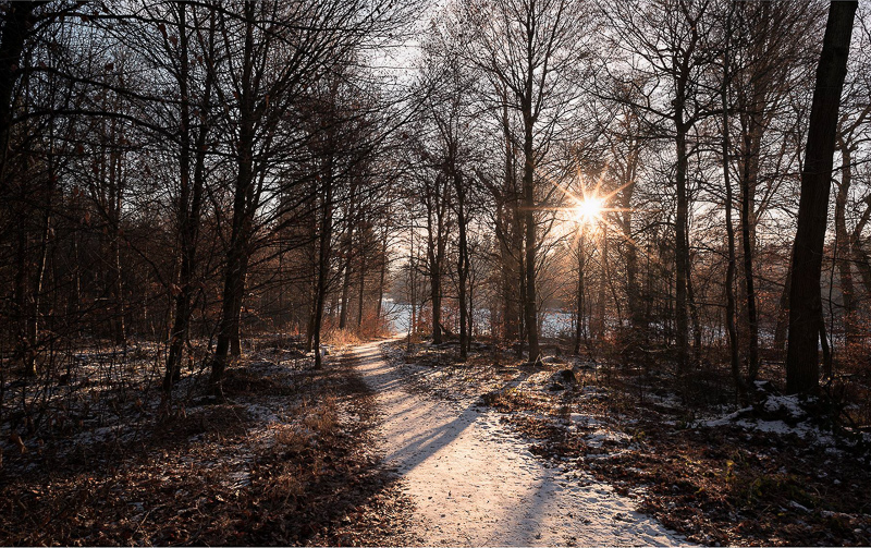
High contrast, green tint
In the upper one exposure control is very good. But as written above the green tint does not really work for me here. In the lower one the color of the snow looks a bit odd to me.
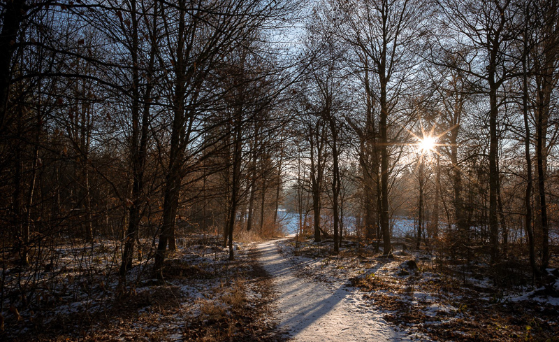
High contrast, neutral
Quite a few decided to go for a color neutral edit. I like all of these but there are some noteworthy differences: some added a vignette while others removed it. Matter of taste. I think with the bright snowy path leading into the scene an added vignette is not absolutely necessary.
High contrast, warm tint
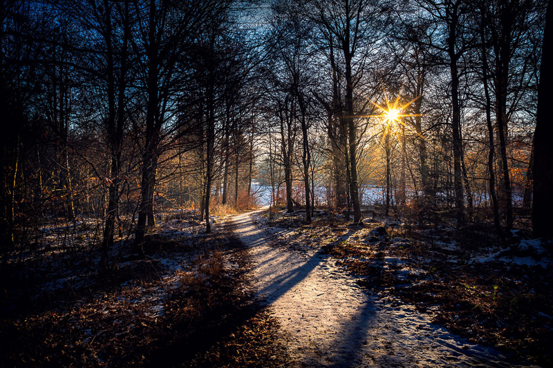
Five decided to go for a little warmer tint. The problem here is: by adjusting the white balance for the entire photo you start to lose the blue color in the sky (see last 2 photos of this block). I guess the others used either split toning or gradients to retain the blue sky.
Personally I prefer these, as the slightly blue sky with the warm foreground makes for a nice color contrast.
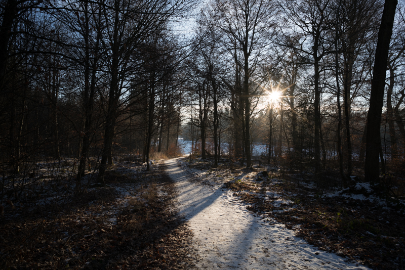
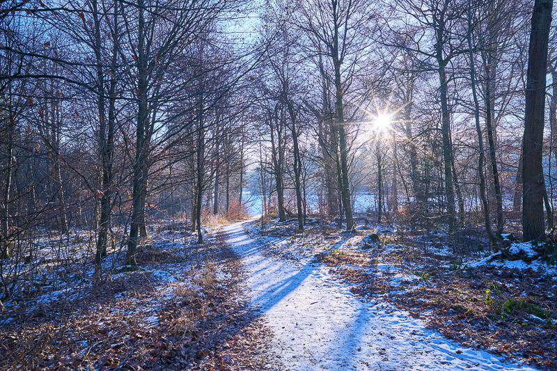
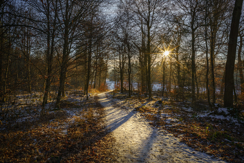
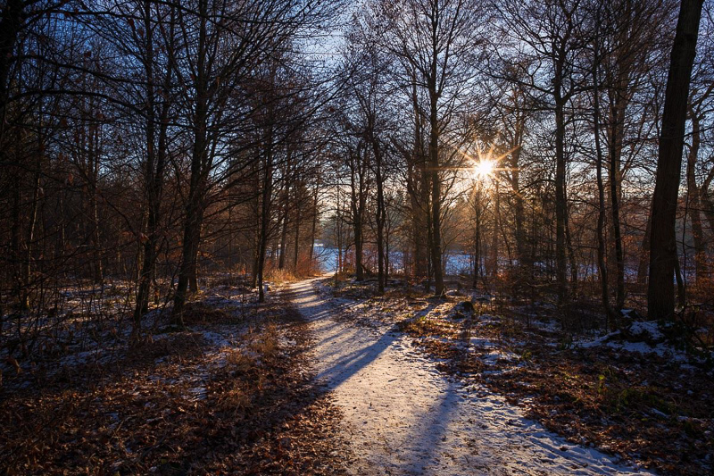
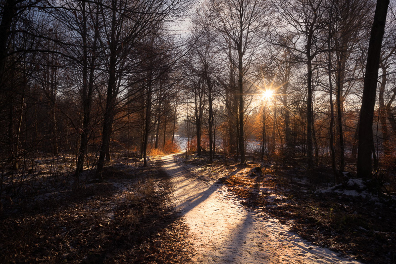
My original version:
I also decided to go with a 16:9 crop, as some of you did as well, and tried to correct the slight tilt. All editing was done in Lightroom only.
I definetly wanted to keep the high contrast of the scene, so I decided not to lift the shadows as much as possible but retain almost black in the trees.
I didn’t alter white balance or exposure but added contrast +40, adjuststed lights -50 and shadows +84. No alterations to the tonal curves have been made.
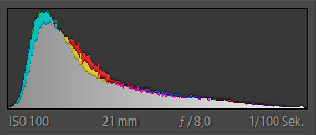
Some of you cut the shadows or let the highlights blow out slightly. This is the histogram of my image:
So I decided to go for a boring even exposure here, doing neither.
The shadows had some green tint which I didn’t really like so I added a split toning for the shadows (289/9). Very often the color/tone of the darker areas is different from the one of the areas directly lit, so I regularly use this feature. The benefit of this method here is, you don’t alter the blue of the sky, as you would, when only adjusting global white balance.
To get a more even exposure I used a gradient from each side (+1 EV) to light up the darker areas without affecting the brighter center of the image.
A slight Orton effect might have been favourable here, but I think this effect has been totally overused lately so I tend not to use it.
Other Articles
- Tripods for mirrorless cameras
- Overview: Lens Reviews
- User-Guide to wide-angle lenses for Sony a7 a7II a7rII
Latest posts by BastianK (see all)
- Lens & Accessory Spring Sale - April 11, 2024
- Analogue Adventures – Part 30: Kodak Portra 800 C-41 - April 11, 2024
- Review: Nikon Nikkor 55mm 1.2 Ai – The first f/1.2 F-mount lens - April 6, 2024
Nice to see all different edits of the same picture. I really liked the challenge 🙂 Maybe it would be fun to do with other kinds of shots (astro shots etc.) in the future!
You are brave to publish a (constructive) criticism. There are very few places where a sincere opinion can be found. My congratulations!
Please do this challenge more often, try something more demanding like a portrait or lndscaoe portrait 🙂 .looking forward to some editing !
It’s good to see topic about the artistic side of the pictures ! it’s cool to see nerdy technical details but we often forget the main thing about photography as actually to make an image! ^^
This challenge is a good idea, I would have liked to participate, it’s a really good way to progress!
I like the style of post-editing in this blog, that feels much more natural to what we keep seeing in Instagram, 500px, Flickr…
For the next challenge, can you make an announcement in this website?
Indeed, I live in China where Facebook is banned…
We will take this into account and probably publish it here as well.
Great, thanks!
Thoroughly enjoyed this article. Interpretation and comments about rendering are indeed educative and eye-opening. Did not participate (was not aware) but would like to in the future…
In general, congratulations on one of the best (i.e. unbiased and complete, structured and illustrated) photo review sites around. Great job(s)!!
I hope that next time I will be on a PC to try one too 🙂
Always better out shooting than sitting in front of a PC 🙂