Introduction
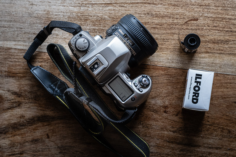
After getting back into film and starting the Analogue Photography series with the iconic Kodak Tri-X, I turned to its European counterpart for this round — the equally legendary Ilford HP5 Plus. Long favored by press photographers, photojournalists, and enthusiasts who needed a reliable workhorse, HP5 Plus has earned its reputation as a versatile and forgiving black-and-white film.
For this installment, I chose a location much older than the film stock itself — a historic engine factory that felt like the perfect match: the Pythagoras Hot-Bulb Engine Factory.

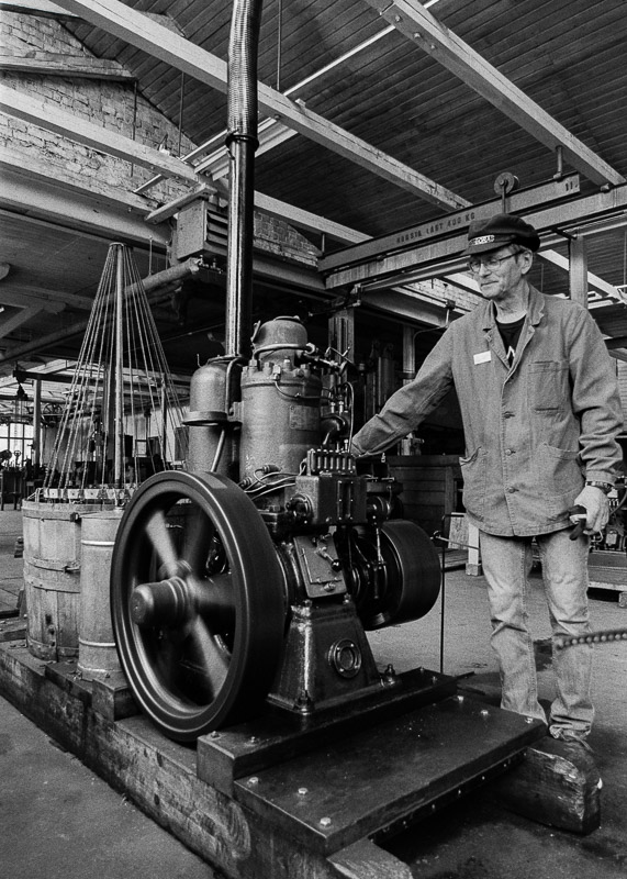
High up on the southern hills of the city of Norrtälje, Sweden, stands the Pythagoras Hot-Bulb Engine Factory. Once upon a time, engines were built here and sold all over the world, and the place was alive with the sound of work. Today, the factory remains much as it was — preserved as a living museum.
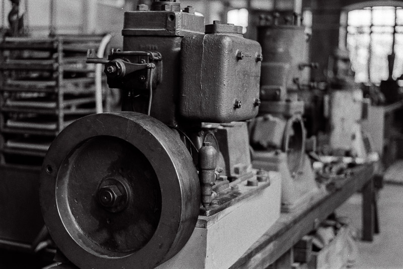
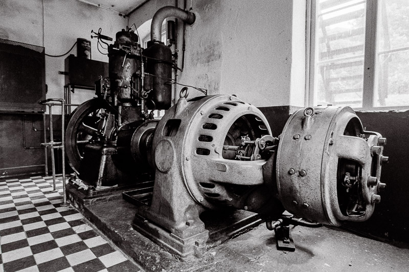
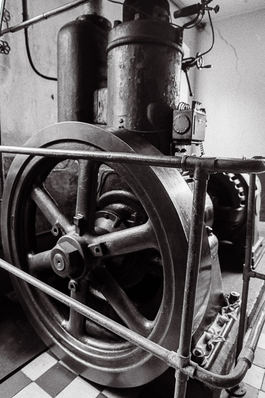
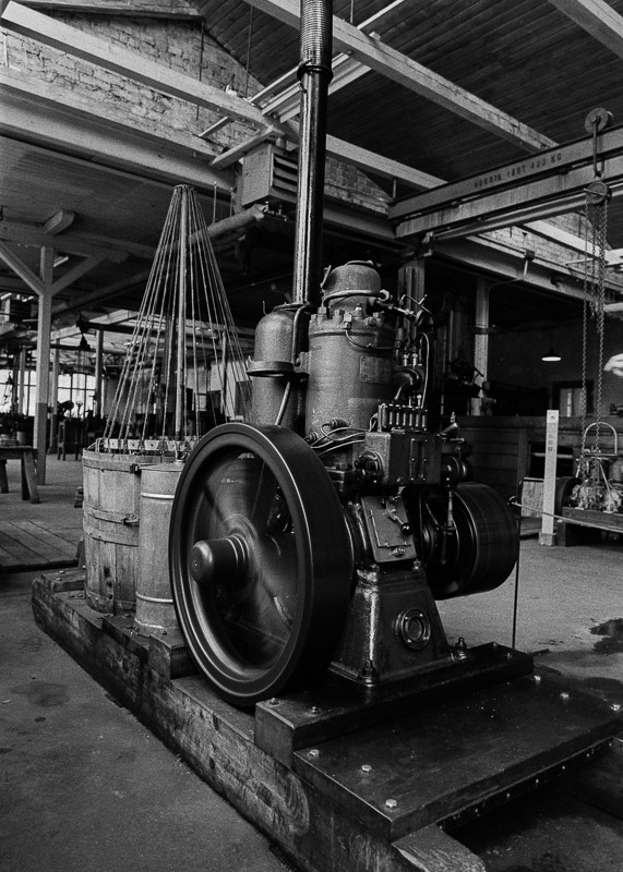
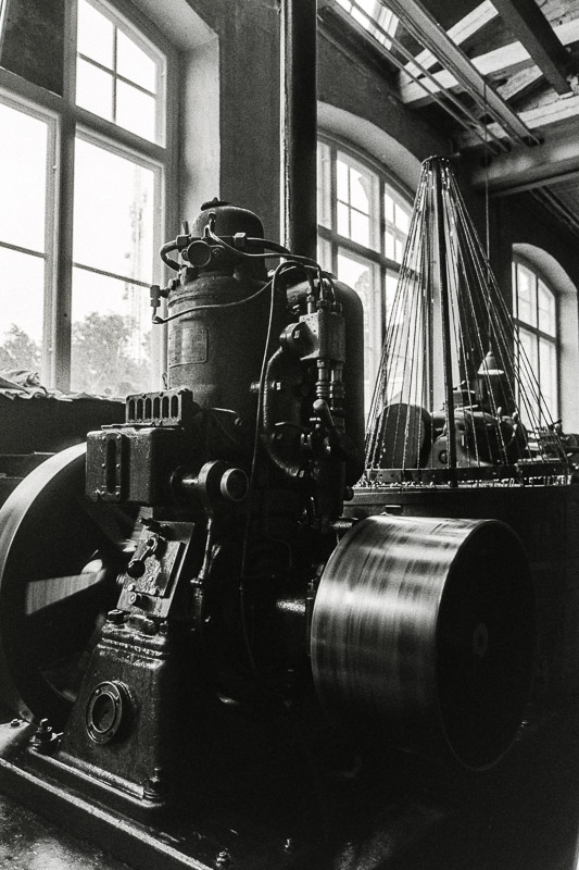
Hot-bulb engines became popular in the late 19th and early 20th centuries, especially for marine, agricultural, and stationary use for their simplicity, reliability, and fuel flexibility. They could run on almost any low-grade fuel oil (kerosene, crude oil, even animal fat). This was a big advantage in rural or maritime settings where refined fuels weren’t available.
There’s something for everyone to discover here: stories of the people who lived and worked at the factory, machines and engines that still rumble and rattle, business offices with their original furnishings, and workers’ homes from the 1940s complete with kitchen rugs and herb gardens. Children can play and learn in Children’s Pythagoras — a 500-square-meter former test hall. There are also smaller exhibitions to explore and a cozy café in the old forge.


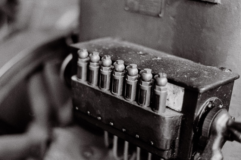
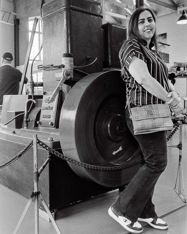
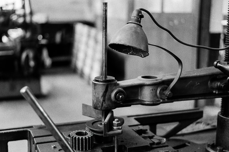
What is now Children’s Pythagoras was once the factory’s old test and packing hall. Back then, it was known as the Wolf Pit — but don’t worry, it had nothing to do with real wolves! The name came from engines that had some defect; these “wolves” were tested here. During testing, power output, fuel consumption, and other performance aspects were measured. Afterward, the engines were packed into large wooden crates and shipped off to customers around the world.
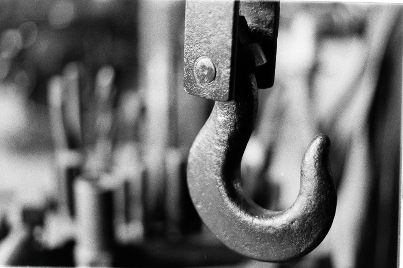
Pythagoras is a genuine factory frozen in time — a place where the early 20th century lingers in the air. The scent of iron and oil greets visitors as they step inside, carrying them back to the era when Sweden was becoming an industrial nation. Every corner feels untouched since the last worker left, as if time itself has paused.

Founded in 1898 in Norrtälje, the Pythagoras Engine Factory quickly grew into the city’s largest workplace. Here, machine tools clanged and engines roared, but it was the hot-bulb engines that earned the company worldwide fame. From this small town, engines traveled across the globe, powering agricultural machinery, fishing boats, and other vehicles.
By the early 1980s, however, the factory faced demolition — until a determined group of enthusiasts stepped in to save it.

In 1992, the engine factory was declared a listed building and transformed into a living museum. Today, it’s preserved and run by the Pythagoras Engine Factory Foundation, with the support of the Pythagoras Vänner association, allowing visitors to step back in time and experience a piece of industrial history.
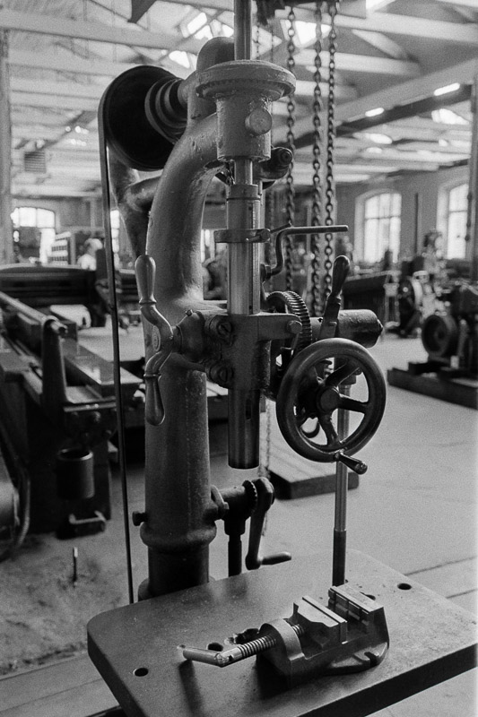
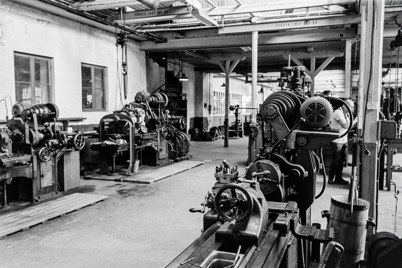
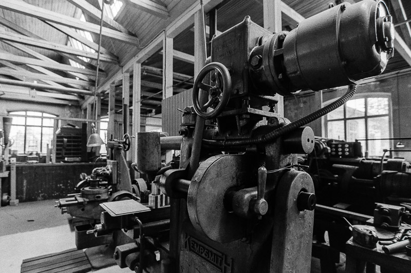
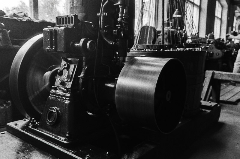
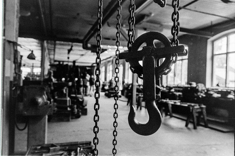
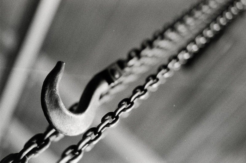
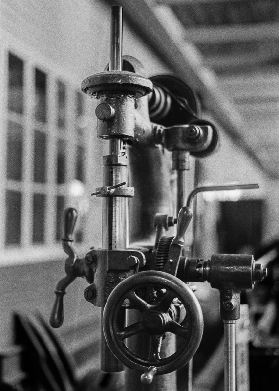
The factory has remained nearly intact since operations ended in the 1960s. The office still holds its original drawings and archives; the machine hall is filled with engines and tools, waiting as if for the next shift to begin.
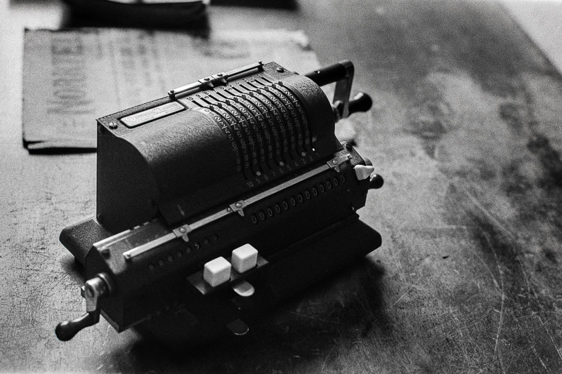
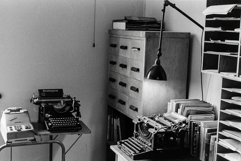
Inside, there are drawing offices, business offices, and a separate room for the director. The old Bakelite telephone still rings with someone wanting to order spare parts.


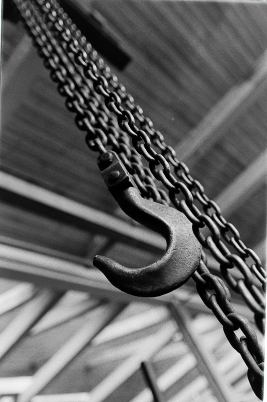
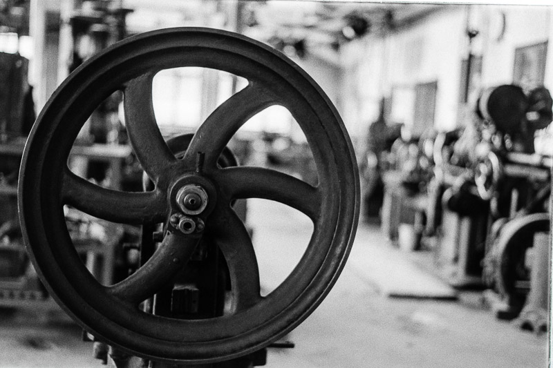
Now, it lives again as a working museum: lathes hum, belt transmissions rattle across the ceiling, and hot-bulb engines thud and vibrate during tours. When the doors swing open, visitors aren’t just entering a museum — they’re stepping straight into history, into a bygone era that still breathes around them.

Pythagoras had offices in several locations over the years. This wing was originally built as a storage room but was converted into an office in the early 1930s and remained in use until the business closed in the 1960s.

Conclusion
This film stock is as versatile and reliable as the Kodak Tri-X I discussed in the previous article. Right off the bat, I’d like to emphasise that I like both, but there are differences — and I prefer one over the other depending on the subject matter. While Tri-X has long been the market leader and favourite in the Americas and other parts of the world, Ilford HP5 — and later HP5 Plus — became the go-to choice in Europe among pros and enthusiasts, from photojournalists and documentary shooters to anyone working with available light — and that’s not without reason.
Both films share that unmistakable classic look, yet their grain structures and tonal qualities set them apart. Some people swear by Tri-X for everything, while others love HP5/HP5 Plus for its subtler character. HP5’s grain gives images a nostalgic texture like Tri-X’s, but it’s softer and its contrast is a bit lower. Personally, I prefer this look for most of my photography — though I still love Tri-X for its coarse grain, deep blacks, and high contrast that give certain subjects a punchy, graphic edge.
Which one do you prefer?
Buy Ilford HP5 Plus on Amazon (Affiliate link)
Alternatives
Kodak Tri-X 400 on Amazon (Affiliate link)

All the pictures in this article come from a single roll of HP5 Plus, shot at ISO 400. They were developed in Rodinal 1+25 and scanned to JPG files by bildskanning.com in Sweden, but I photographed the negatives myself to obtain the raw files and gain more control over the tonal edit. You could also use Kodak HC-110 for similar results: high contrast, excellent sharpness, and distinct grain. If you prefer a good balance of fine grain, sharpness, and tonal range, I would recommend developing the film in Ilford ID-11 or Kodak D76, though. For the finest grain and good sharpness, you can try Ilfotec DD-X, Kodak XTOL, or Adox XT-III.
Writing articles like this takes a lot of time and resources. If you found it helpful or are planning to buy something online, please consider using one of our affiliate links (Amazon).
Not buying anything? If this article was useful, interesting, or helped you save money, consider treating us to a coffee (donate)!
Further Reading
- What camera gear and accessories do I use most frequently?
- Analogue Photography – Part 1: A Personal Journey into Film Photography 1/2
- Analogue Photography: A Personal Journey – Part 2 – Embracing Colours
- REVIEW: Meyer-Optik Görlitz Trioplan 50mm f/2.9 V – Soap Bubble Bokeh Treasure or Garbage?
- Analogue Adventures landing page
Support Us
Did you learn something new, find this article useful, or simply enjoy reading it? We’ve put a lot of time and resources into creating it, and your support helps us keep going. If you’d like to show your appreciation, please consider clicking the Donate button!
![]()
![]()
![]()
![]()

(Donations via Paypal or bank card)
What’s in my camera bag? MY 2024 KIT!!
- Main camera : https://amzn.to/3TsGtKg
- Camera grip : https://amzn.to/4e0G3CR
- Memory Card 1: https://amzn.to/47pA20i
- Memory Card 2 : https://amzn.to/3XHYxlZ
- Camera 2 : https://amzn.to/3Xifou8
- Camera grip: https://amzn.to/4dYYpV9
- Memory card 1: https://amzn.to/4e5h2H0
- Memory card 2: https://amzn.to/3zu7W7n
- Small travel tripod: https://amzn.to/4goIX68
- Mini tripod: https://amzn.to/4e09XXX
- Small shoulder bag: https://amzn.to/47tPMiY
- Medium shoulder bag: https://amzn.to/4ej4bjY
This site contains affiliate links, for which I may receive a small commission if you purchase via the links at no additional cost to you. This helps support the creation of future content.
Martin
Latest posts by Martin (see all)
- REVIEW: Nikon Z 20mm f/1.8 S - March 25, 2026
- Review: Nikon Z 24-200mm f/4-6.3 - March 22, 2026
- Analogue Photography: Part 6 – Kodak Gold 200 - March 11, 2026
Thank you for the beautiful pictures and the very interesting insight into this fantastic industrial museum. Regarding your question: I myself have used 120 TX400 as my standard film. Here, in relation to your articles, the chosen processing method seems to suit the HP5+ much better than the TX, because I quite like the tonal values; they suit the subject matter, I think.
PS: I always find it a bit misleading when people talk about “high-contrast” TX and “balanced” HP5, since there’s no standard process for black and white film. How high-contrast the negatives become depends on how they are exposed and developed. If there are differences, they’re more likely in terms of color sensitization and the shape(!) of the gradation curve (which, of course, also depends on the processing).
You’re right that there is flexibility in final outcome across black and white stocks, but trying to say that each film stock doesn’t have a different amount of contrast irrespective of the development and scanning process fails to take into account the make up of each film stock. They are different, and thus have different properties. Written as someone who works in a professional film lab.
Where did I claim there were no differences between SW films?
SW = B&W ;‐)
I don’t have much knowledge about colour sensitisation, and I agree that that you can enhance or dampen the contrast of the final picture through exposing and developing (and back in the day even through the choice of paper), but I also know that two different films with the same exposure and same processing can produce images with different contrasts.
Ordinary black and white films don’t have a “standard contrast” that can be increased or decreased through exposure and development. That’s simply not how analog black and white photography works. Even if you consider the box speed as the “standard,” the correct development time is always the one that, for that exposure, produces the contrast—that is, the density curve with the gamma value—that my combination of enlarger lighting and paper requires. This “normal contrast” can then be adjusted again through development, depending on the exposure, the existing subject contrast, or personal preference. I fail to see the point in knowing that two films will achieve different contrast with identical development. It’s completely irrelevant. How does anyone even come up with the idea of developing different films the same way? That would be like saying a gasoline engine is better than a diesel engine because the latter won’t run if you fill it with the same type of gasoline.
Different film stocks behave different to the extent of having visible different contrast levels not just on the same processing and scanning settings, but on the detail levels in the shadows and highlights, irrespective of how you dampen the contrast curve in the final scan.
Now, the nominative “film contrast” term was introduced when film was mainly printed directly on paper, where you cannot really control the contrast as you do with digital scans. There was more important how negative film interpreted a scene and reproduced it on the final image.
Knowing the contrast behavior of a stock was essential in choosing the right photo paper base on the desired final look, which is a deeply subjective taste.
Regarding “detail levels in the shadows and highlights, irrespective of how you dampen the contrast curve in the final scan”, I had already explicitly pointed this out above by writing “If there are differences, they’re more likely in terms of color sensitization and the shape(!) of the gradation curve (which, of course, also depends on the processing).”
Regarding the statement that “the nominative ‘film contrast’ term was introduced when film was mainly printed directly on paper, where you cannot really control the contrast as you do with digital scans,” this is not entirely accurate, because negatives were never printed directly on paper, at least not by those with any standards. Only incompetent amateurs, or large photo labs or drugstores that offered small prints in mass production at low cost for the average snapshot taker, did so. Contrast was influenced by the chosen paper grade (ultra-soft to ultra-hard), to a limited extent by the chosen developer and its dilution, by the ratio of exposure time to development time, by the type of enlarger (directional or diffuse light), and possibly by subsequent toning with selenium, but also, for example, by diffuse pre-exposure of the paper or by clarifying highlights using Farmer’s reducer, which was applied to the entire image or, using cotton balls or ear swabs, only partially. There were other tricks, but that would go too far.
Regarding “Knowing the contrast behavior of a stock was essential in choosing the right photo paper base on the desired final look, which is a deeply subjective taste,” that’s correct, but only if you’re referring to the contrast of the individual negative, not the film contrast. The contrast is a combination of film contrast and subject contrast. Ideally, you expose and develop the negative based on the subject contrast so that it prints well on paper with a normal contrast grade. However, since we’re not talking about sheet film but roll film, which typically produces negatives with significantly different subject contrasts, this is purely theoretical, and every film development process will involve a compromise.
Until 2020, I photographed exclusively with analog cameras and 90% in black and white, which included the negative and positive processes. Incidentally, I have personally carried out everything I have talked about in practice and am therefore not repeating anything I read on the internet, but my own experiences.
It might just be my monitor, but it looks to me like there are quite significant white balance differences across some of the scans here.
Loving the analogue adventures series, please keep it going!
There are some differences in the tint, I photographed the negatives one by one, during a period of 35-40 minutes when the sun was going down, and I had the a window in the room, which could have the colour shift effect between the negatives. Otherwise, I cannot come up with any other reason.
Dear Martin, please don’t misunderstand me, but the fact that you believe the prevailing color temperature during shooting could influence the color tone of a black and white negative or print leads me to believe you’ve never actually dealt with analog black and white photography. There are film base discolorations that can have various causes, but are completely independent of the shooting conditions and, of course, always affect the entire film. And then there are paper base discolorations that have nothing to do with either film base discoloration or shooting conditions.
The coloring of the JPGs shown here is simply due to the electronic image processing by the lab.
I’m truly sorry to have to judge so harshly, but it pains me to read such nonsense.
Please don’t take this post the wrong way. I don’t know how to phrase it more politely.
From your comment it seems you didn’t read the full article, and you also misunderstood what I wrote about the colouring.
I mentioned that I photographed the negatives with my digital camera to get RAW files, instead of using the lab’s JPEGs. So none of the images in the article come from the lab’s JPEG files.
Photographing the negatives the way I did can influence the final look. Even though the negatives were greyscale, I photographed them in colour, and the light temperature during that process can definitely affect how the image turns out. As the light shifts from daylight to evening, the colour temperature in the room changes, and that can affect the hue of the images I photographed.
Thanks for the explanation. I hadn’t actually thought of that when reading the comments. If your statement referred to the lighting conditions when photographing the negatives, then it was perfectly plausible, of course. Please excuse me, I was genuinely wondering. 😀 However, changing ambient light is obviously unsuitable. But that’s not the point here.
So, once again, apologies for the misunderstanding!
To avoid such inconsistency I suggest to save(export) the final jpg files as grayscale to get consistent(and smaller) output.
That is a good solution, but from the beginning I intended to do some toning on the pictures, so I kept the images in colour space. In the end I liked them as they were and decided not to tone them, which is why there’s some variation in the tones from image to image.
I also really like the image tone. Probably because it reminds me of my preferred paper, the Fomatone MG FB 131 🥰.
I love the pictures, and I think the contrast looks great! If I ever make it to Sweden, I’d love to take my son to this museum. Thanks for sharing.
Thanks and You are so welcome
Back in the 1960s, once I started using Ilford films, I much preferred them to Kodak B&W, for reasons of grain structure and tonality. But not souped in Rodinal, I didn’t think it complemented the Ilford films characteristics very well, I thought developing in Ilford ID-11 or Kodak D-76 (both diluted 1:1), or Ilford Perceptol or Kodak Microdol-X (both diluted 1:3) suited them much better. Back then, it was before the current “Plus” versions, and the 400-speed film was HP4, not HP5. Oh, and the Ilford films dried with significantly-less curl than the Kodak ones, IIRC. Don’t know if that’s still true for the current “Plus” ones.
Incidentally, in case anyone’s interested: Back in the analog days, after a rather unscientific and therefore quite pointless phase of experimenting with different films according to the manufacturer’s instructions, I settled on Kodak TX400 120 (meaning I densometrically tested my process for it), packed hundreds of rolls from the same production batch into the freezer, and have enjoyed consistently good negatives ever since. But then the day came when I also wanted a lower-sensitivity film as an alternative for certain situations. Kodak PXP 125 was no longer available, Agfa APX 100 was also discontinued, Foma’s quality control left much to be desired, I didn’t like Ilford Delta or Kodak T-Max, and so only Ilford FP4+ remained, which I remembered as rather dull, lacking contrast and vibrancy. I still tested it once at the same gamma setting I normally use for the TX400, and then photographed a test subject, using the TX400 in one magazine and the dn FP4+ in the other. Then I went into the darkroom and tried to make a print from the FP4+ negative that came close to the print from the TX400 negative. I just dug out the prints again.
And what can I say? If I hadn’t labeled them on the back back then, I definitely wouldn’t have been able to tell which print came from which film.
And that’s with two films that could hardly be more different: Ilford FP4+ and Kodak TX400. And all this in a purely analog process, completely without electronic image processing!
Therefore, I would argue that nowadays, when “analog” is often used to mean hybrid, it’s pretty much irrelevant whether you load an HP5+ or a TX400 into the camera. Any differences in the gradation curve are easily corrected here. If there are differences between films, then, as mentioned, they lie in the subtly varying color rendering, which very few people can even detect, even if you point it out to them.
And of course, given different sensitivities and grain structures, there are differences in resolution, edge sharpness, and grain—that’s clear.
Therefore, I would give everyone interested in analog photography the same advice that has been given to generations before them for many decades: Good negatives don’t result from unplanned experimentation with many different films, but rather from getting to know and mastering a specific film, which you should stick with for a while. Once you’ve reached that point and understand how processes work and how to influence them in a targeted way, then it’s worth experimenting—not before.
And if anyone wants to try and tell the difference between FP4+ and TX400, feel free. I’ve placed the prints side by side and photographed them. Enjoy!
https://flic.kr/p/2rKstrR