Update January 12, 2026:
After the first publication, several people noted that the colours were off, so I reworked the colour conversion for all the images.
This time I used the Negative Lab Pro software for conversion.
What you see now are the updated versions.
Introduction
In my previous articles, I explored two of the most classic and iconic black-and-white films: Kodak Tri-X and Ilford HP5 Plus. Now I turn my eye to a classic colour negative stock — Kodak ColorPlus 200.
This film is said to be based on an older emulsion technology, one tracing back to the 1970s and 1980s (Kodacolor II / Kodacolor VR). That actually makes it older than Kodak Gold, which many already consider to have a vintage look. So this one should offer an even more vintage feel. Let’s have a look at the images.
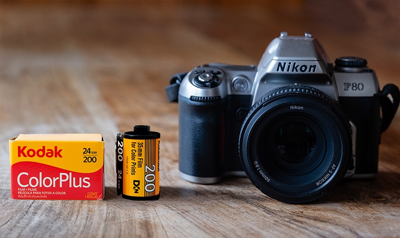
 I tested this film in a Nikon F80 with Nikon AF-S 50mm f/1.8G, digitised with a Nikon Zf, TTArtisan 100mm/2.8 macro 2X, and JJC film digitizer
 You can see this review as a YouTube video here!
![]() Sample images in high resolution here.
Sample images in high resolution here.
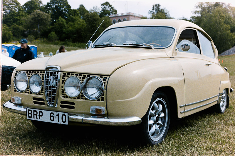
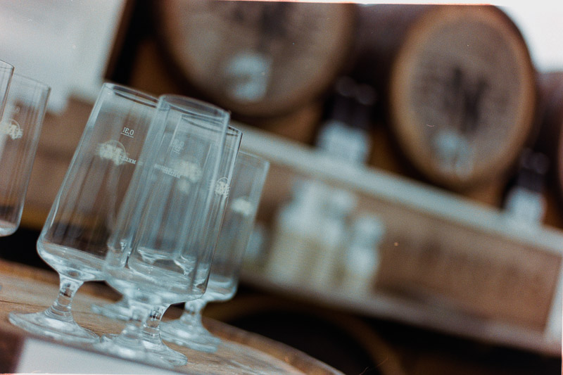
The photos in this article all come from a single roll of Kodak ColorPlus 200 (135-24), I ended up with 25 frames from the 24-exposure roll, and I’ve included all of them (the whole roll) in this article. The film was shot at ISO 200 and developed by bildskanning.com in Sweden. I digitised the negatives by photographing them and converting them into positives in Lightroom.
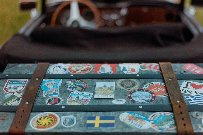
For this installment, I chose a theme that matches the film’s vintage character — a classic car event. In fact, it’s the same event I photographed on Kodak Tri-X for my black-and-white images.
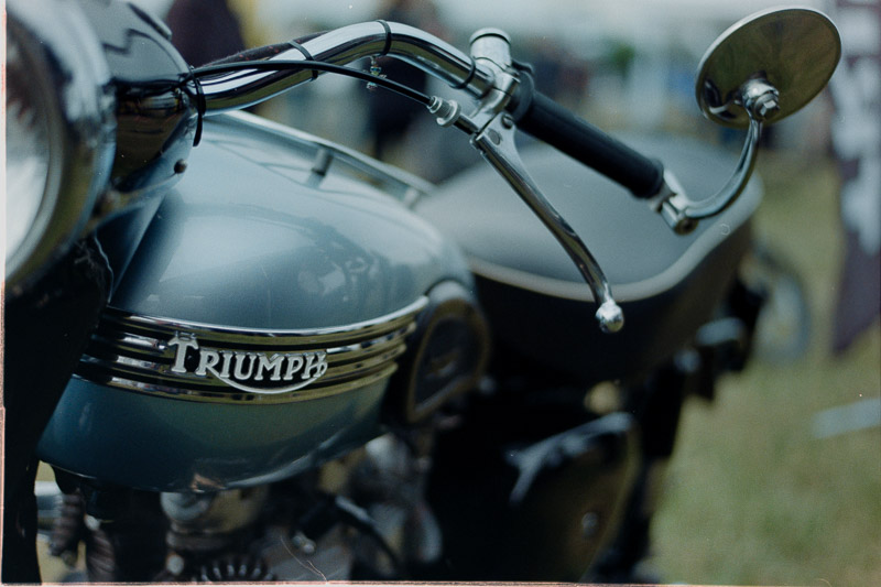
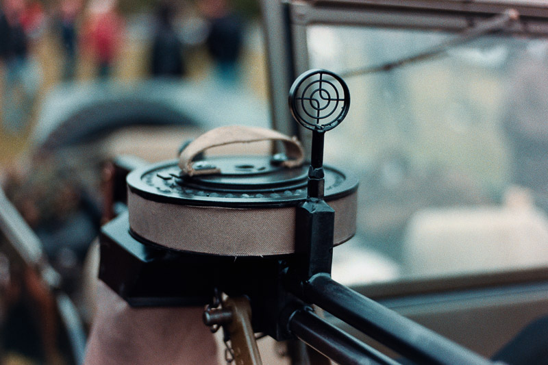
The Classic Car Race/Show
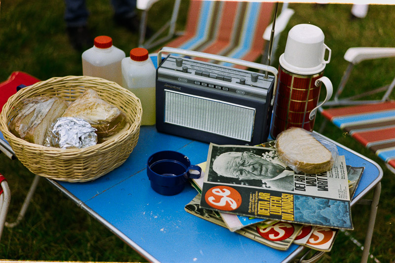
The event is a mix of a classic car race, an exhibition of beautifully maintained old-timers proudly presented by their owners, a family-friendly happening with activities for children, and a laid-back picnic venue with food trucks — and plenty more going on besides.
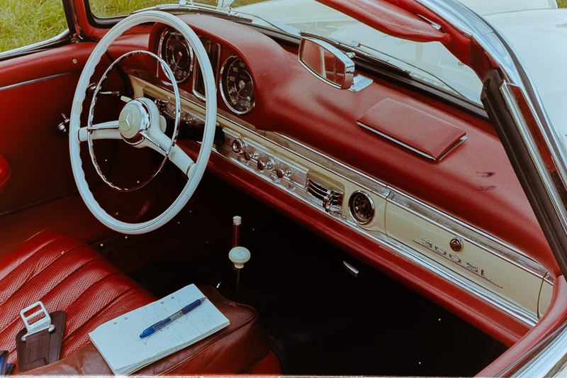
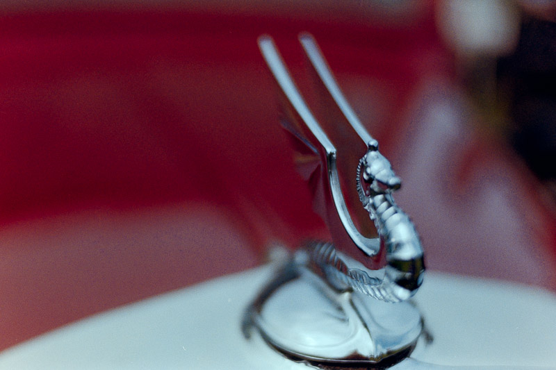
First, I snapped a couple of frames of the race itself, or actually of a couple of the cars in the race.
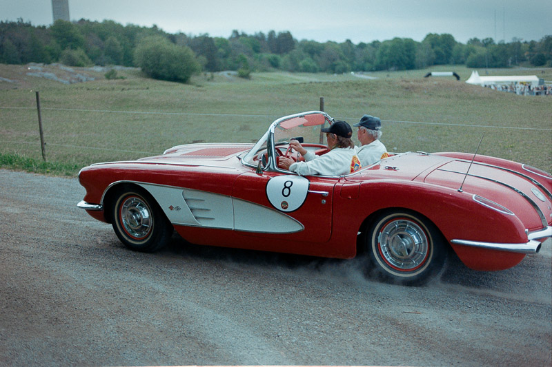
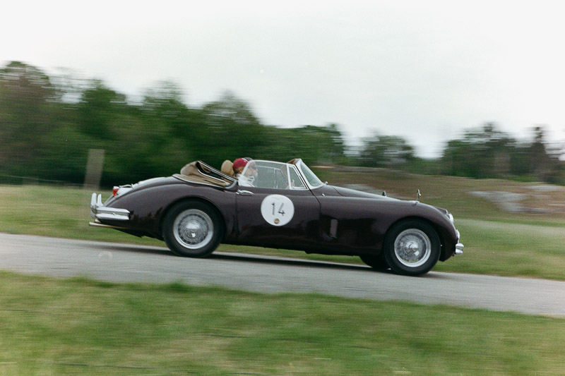

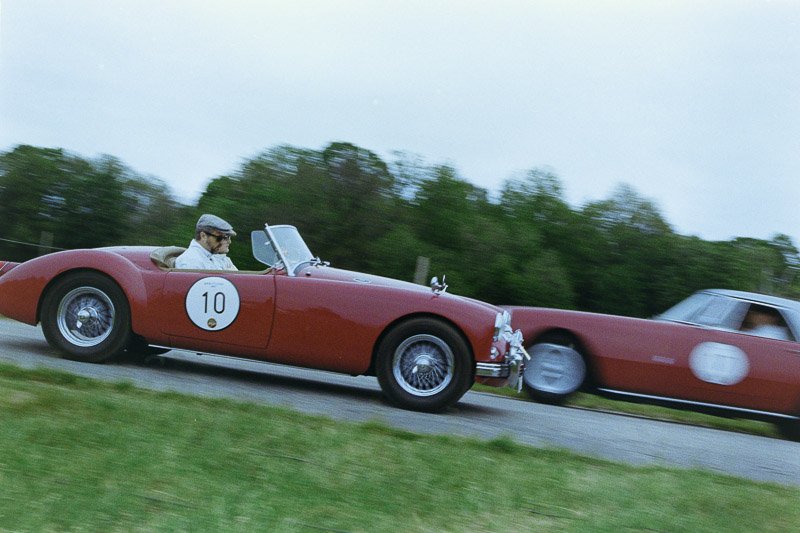
With digital photography, you can see in an instant if the image matches what you envisioned, simply by glancing at the display on the back of the camera. With film, there’s no such certainty — you press the shutter and trust your instincts, hoping the light and timing are kind. Photographing fast-moving vehicles at close range is a delicate dance with chance, each frame a negotiation of shutter speed, aperture, and the sweep of panning, all trying to capture the blur and depth-of-field the mind imagines. Later, it became clear that some of the shots had worked, though in the moment, uncertainty lingered, thick as the morning fog. To steady the hands and the mind, attention shifted to a few stationary cars — quiet shapes in the soft morning light, beneath a cloudy sky that seemed to hold its breath, waiting for clarity.
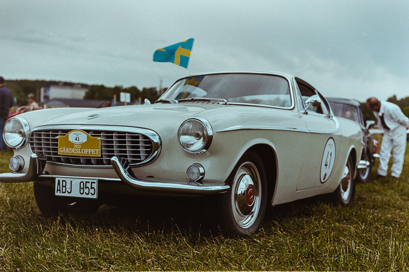
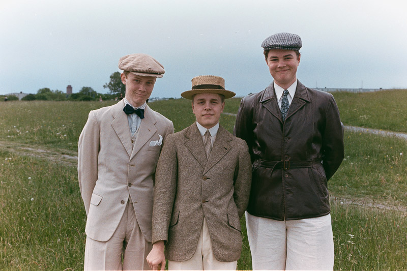
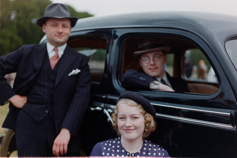
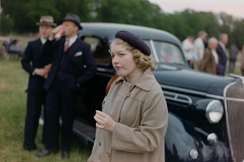
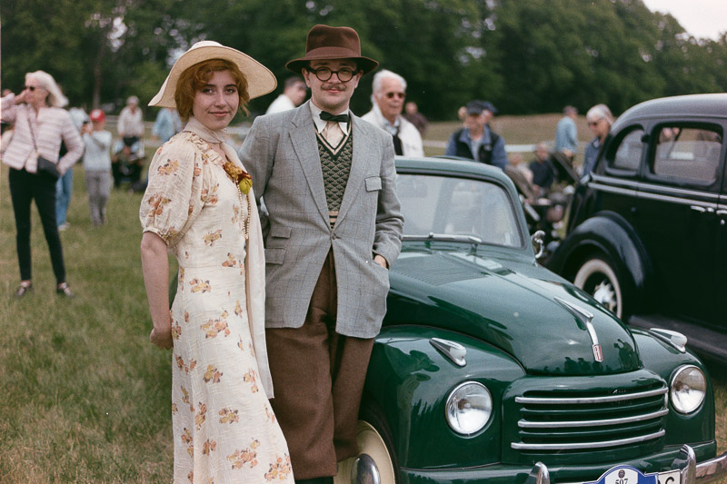
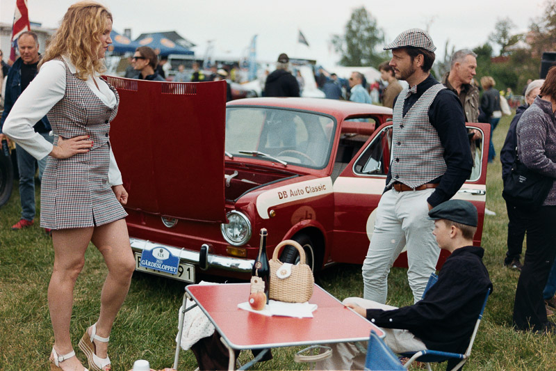
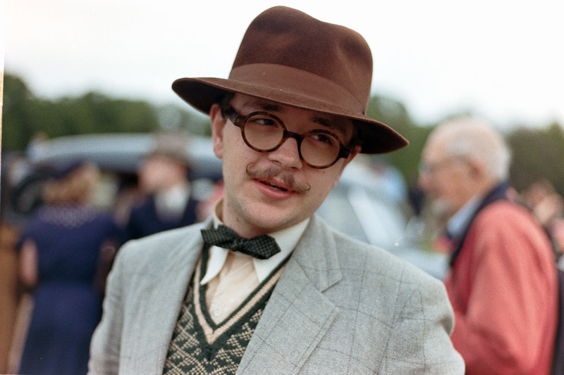
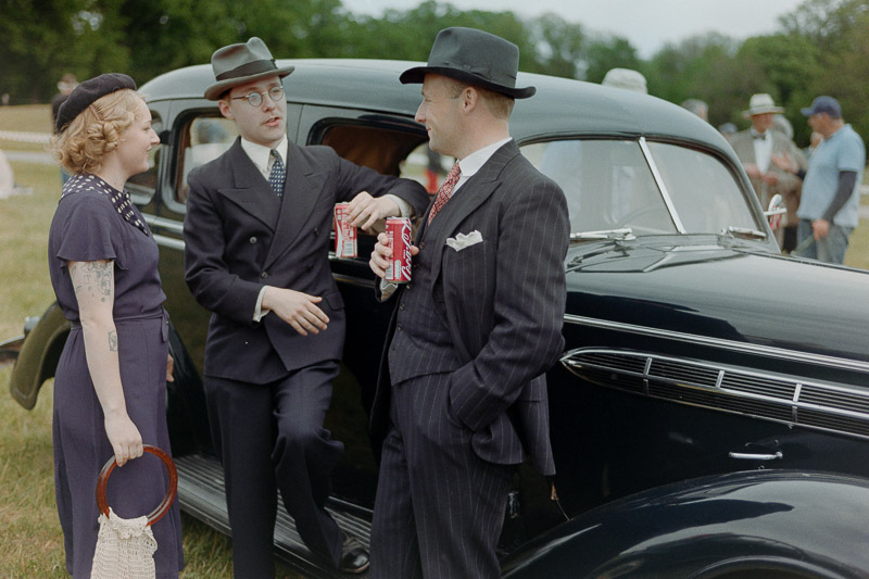
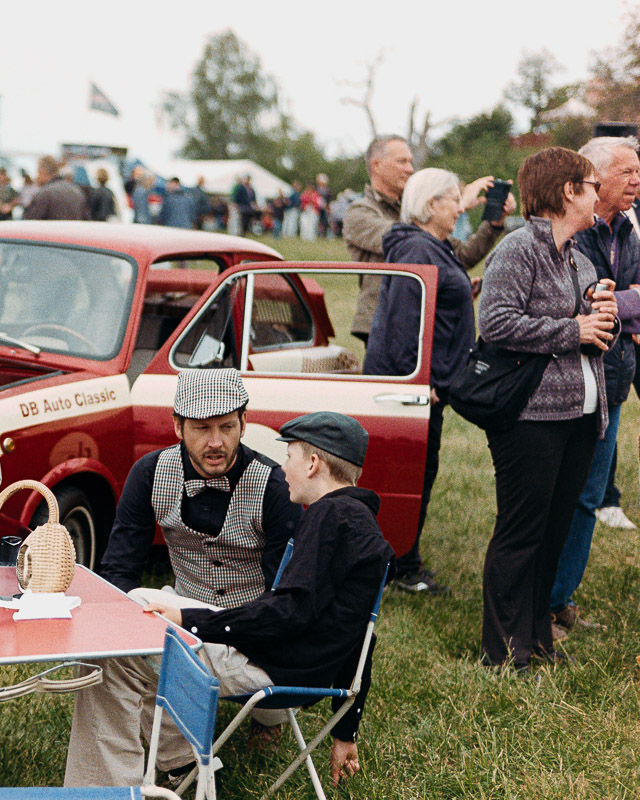
Concurs de Charme
The event also featured a competition, which, to me, was more interesting than the race: the Concours de Charme. In this competition, the overall charm and style of the entire presentation are judged based on three main criteria:
- The Car’s Character: This includes its restoration quality, unique charm, and story.
- Period Attire and Harmony: The driver and passengers must dress in clothing that is period-correct for the year of the car, creating a sense of harmony between the vehicle and its occupants.
- Theatrical Presentation: The crew is encouraged to bring time-appropriate accessories to enhance the overall impression.
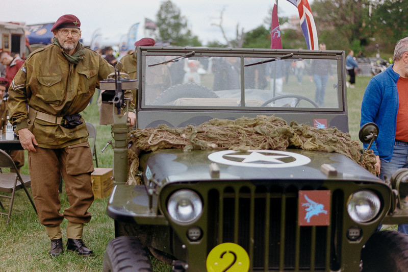
There were several contenders in this category, each interesting in its own way. Here is a small selection that I managed to photograph.
But the one I loved most of all was a much more recent car. This guy’s family owned a BMW in the early ’70s, when he was a child, and they used it to travel all across Europe. The car was sold before he moved out of his parents’ house in his early teens. Decades later, in his fifties, he found a similar car on the used market—it even had almost the same colour. He called his mother to ask if she remembered the old registration number. Unfortunately, she didn’t, but as people did back then, she had kept some old papers. And guess what? To his astonishment, he discovered it was the exact same car. He bought it, restored it inside and out, repainted it to match its original look, and now brings his whole family to events like this—complete with period-correct clothes and accessories—recreating his cherished childhood memories.
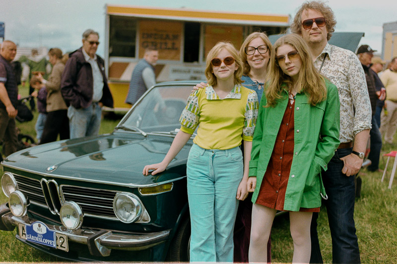
The guy with his family and their BMW took first place. The WWII Jeep and its crew came in second, and the American car with its team finished third.
Conclusion
Kodak ColorPlus 200 has a distinctly vintage character, with tones leaning toward the warmer side, but not as much as Kodak Gold. You can shift the colours toward a more neutral balance, but doing so often pushes the whites toward a bluish cast. Personally, for a vintage look, I prefer a warmer, slightly yellow image with clean whites and a soft, classic feel, rather than a neutral rendering with cool, unnatural blue-tinted whites. If you’re after a classic 1970s look—with matching grain, contrast, and colour palette—this film is made for you. Otherwise, you’re probably better off exploring other film stocks.
Writing articles like this takes a lot of time and resources. If you found it helpful or are planning to buy something online, please consider using one of our affiliate links (Amazon).
Not buying anything? If this article was useful, interesting, or helped you save money, consider treating us to a coffee (donate)!
More Images
Further Reading
- What camera gear and accessories do I use most frequently?
- Analogue Photography – Part 1: A Personal Journey into Film Photography 1/2
- Analogue Photography: A Personal Journey – Part 2 – Embracing Colours
- REVIEW: Meyer-Optik Görlitz Trioplan 50mm f/2.9 V – Soap Bubble Bokeh Treasure or Garbage?
- Analogue Adventures landing page
Support Us
Did you learn something new, find this article useful, or simply enjoy reading it? We’ve put a lot of time and resources into creating it, and your support helps us keep going. If you’d like to show your appreciation, please consider clicking the Donate button!
![]()
![]()
![]()
![]()

(Donations via Paypal or bank card)
What’s in my camera bag? MY 2024 KIT!!
- Main camera : https://amzn.to/3TsGtKg
- Camera grip : https://amzn.to/4e0G3CR
- Memory Card 1: https://amzn.to/47pA20i
- Memory Card 2 : https://amzn.to/3XHYxlZ
- Camera 2 : https://amzn.to/3Xifou8
- Camera grip: https://amzn.to/4dYYpV9
- Memory card 1: https://amzn.to/4e5h2H0
- Memory card 2: https://amzn.to/3zu7W7n
- Small travel tripod: https://amzn.to/4goIX68
- Mini tripod: https://amzn.to/4e09XXX
- Small shoulder bag: https://amzn.to/47tPMiY
- Medium shoulder bag: https://amzn.to/4ej4bjY
This site contains affiliate links, for which I may receive a small commission if you purchase via the links at no additional cost to you. This helps support the creation of future content.
Martin
Latest posts by Martin (see all)
- Analogue Photography: Part 6 – Kodak Gold 200 - March 11, 2026
- REVIEW: TTArtisan Tilt-Shift 17mm F4 ASPH. - March 4, 2026
- REVIEW: Meike 24mm f/1.4 MIX - February 25, 2026
Hi Martin, hate to say it but these do not look correctly converted. Removing the orange mask is mathematically not a linear process, so just setting a global grey point doesn’t do the trick.
If you got those professionally scanned or converted them using specialized software like Smartconvert or NLP the results would look much better, with less of a color cast.
If you want to do it manually, I suggest following this guide (it is still hard though, imo using specialized software is the better approach):
https://www.alexburkephoto.com/blog/2019/10/16/manual-inversion-of-color-negative-film
Cheers
Felix
Thanks. I will certainly have a look at the suggested article and try again to see the difference, but I generally hate to do go thru 15 steps for each single photo. I’ll see if I can find a good conversion through that article and apply it to all the images of that roll.
I also genuinely think the lab did something wrong during the development as the film I received was washed out.
I photographed the negatives myself and converted them in LR as the lab’s JPG files looked much worse.
I’ve reworked the conversion and replaced the images. Have a look!
They look much better now! Some still have a bit of a cast, that can be quite hard to get rid off manually. I like Smartconvert the best when it comes to converting negatives as it’s a standalone application. They have a free demo version as well. But you need to have access to the RAW scans for this
Nice subjects, but the colour is not right. You can make a negative colour anyway you want. A slight deviation, blue, neutral, warm… Negative is not a reference. The colour for these can be adjusted by eye, these are too blue, cyan. I really enjoyed the photos though – thank you!
Thanks, I have to give the converssion another go
The colours are good now and have a nice vibe, more vintage looking but better white balance. Love the chrome. It’s nice how you used open apertures. Well done!
I’ve reworked the conversion and replaced the images. Have a look!
Bonjour,
Like the event and pictures, not the colors…
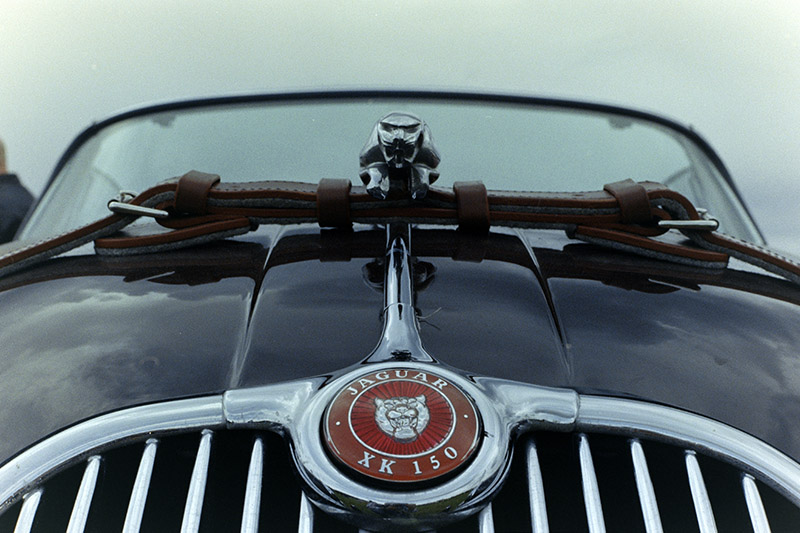
The Bentley convertible is the Jaguar XK 150 of the first image.
Hmm…, more than one commented on off colours. I think the lab did something wrong during the development and I actually did like this cast better than when the whites turned blud. Have to give it another try
I checked all my Kodak ColorPlus images and they all look much different these one’s on article first revision and a little warmer after replacement (also Kodak Gold can look quite the same as ColorPlus). When i started to rescan negatives by myself (by scan, or by re-photo), i see, that every negative can be much different from another even with the same film. You can use standard settings, or you can move every rgb slider. But LR is not good enough because it can’t be moved any rgb sliders, temperature is wrong slider for film. Use PS or ViewScan to use the rights sliders. I can say, that bad scanning is very common problem in labs…
Can your ColorPlus film be overdue?
p.s. photos are great ))
Thanks Pavel,
The film was not expired when I used it. It was first scanned by the lab, but those scans were very washed out and had a strong colour cast. Because of that, I decided to photograph the negatives myself and convert them.
In that first conversion, I mainly darkened the images, increased contrast, and reduced the colour cast. Those were the images originally used in the article. However, they were still quite inaccurate, so I did a second round of conversion. The images currently shown in the article are from that second pass and should be more or less correct.
In general, Kodak Gold should appear a bit warmer than ColorPlus, which is usually more neutral in tone.
Interesting, in my country, usually, labs made ColorPlus warmer than Gold
I’ve reworked the conversion and replaced the images. Have a look!
Thanks for the great photos you took. I love those early BMWs. When I was a student I had a BMW 2002 Baur. The Baur 2002 was kind of a convertible car, more a Landaulet or a Targa with an iron top roof an a foldable canvas at the back side of the roof.
Thanks.
When I was a teenager, this BMW 2002 was my dream car…