Introduction
As promised in my previous analogue articles, “Analogue Photography – A Personal Journey Part 1 and Part 2”, I’ve started shooting with film again and will be sharing the results from each roll in this series.
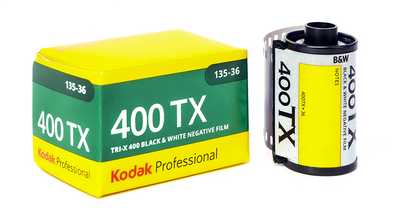
The pictures you see in this article all come from a single roll of Tri-X, shot at ISO 400 and developed and scanned by bildskanning.com in Sweden.
 You can see this article as a YouTube video here!
For the first instalment, I wanted to begin with one of the oldest and most classic black-and-white films available: Kodak Tri-X. It’s a cornerstone of analogue photography, used for generations by renowned photographers. Tri-X first appeared in the 1940s as a sheet film rated at ASA 200, and since 1954 it has been available in 35mm and 120 roll formats at ISO 400.
Almost everyone who has shot film knows—or at least knows of—this stock. It has long been the go-to choice for street photographers and photojournalists, especially in the US. Its distinct “Tri-X look” is synonymous with classic documentary and street photography.
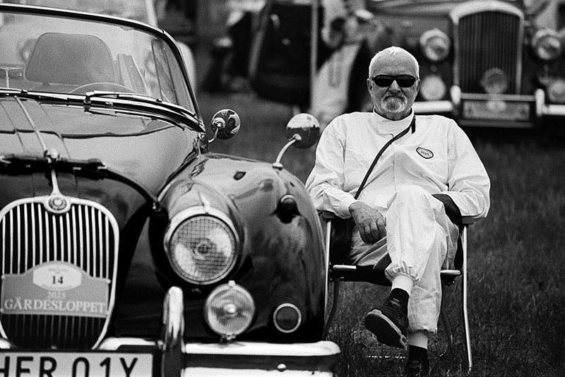
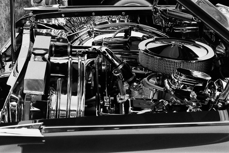
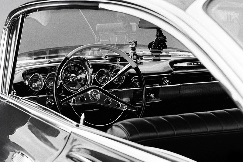
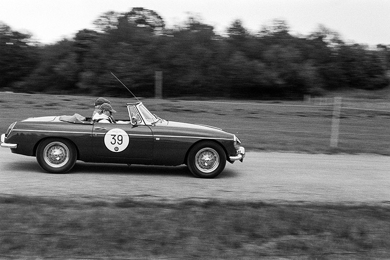
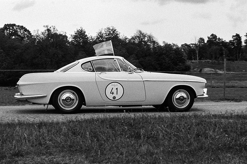
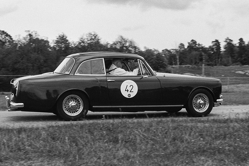
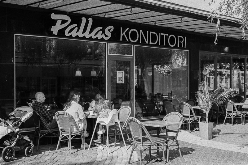
For this roll, I chose two subjects that fit that tradition: a nostalgic car race and exhibition, and street scenes at a suburban shopping centre.
The Nostalgic Motor Race
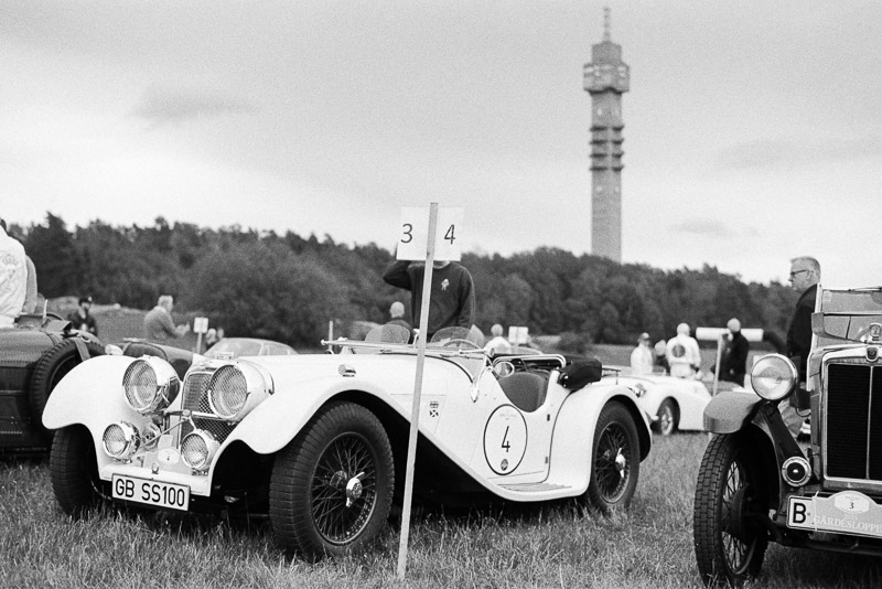
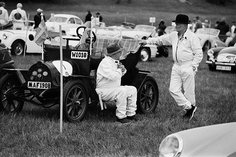
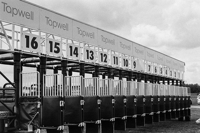
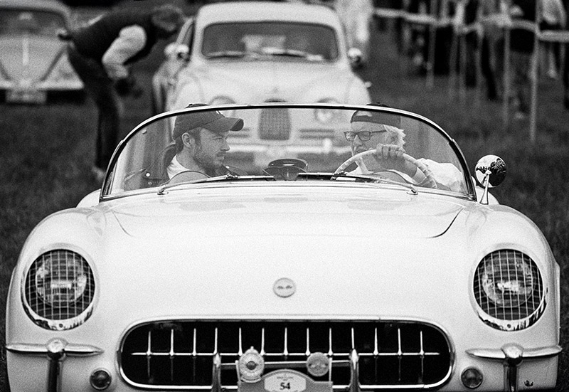
What began in the 1920s as an exclusive speed race has grown into one of Sweden’s most beloved motor events. Today, Gärdesloppet draws tens of thousands of visitors who come for the roar of classic engines, gleaming vintage cars, and the mix of racing nostalgia with a festive, family-friendly vibe. It’s a place where history is alive—not in a museum, but out in the open, running on four wheels.
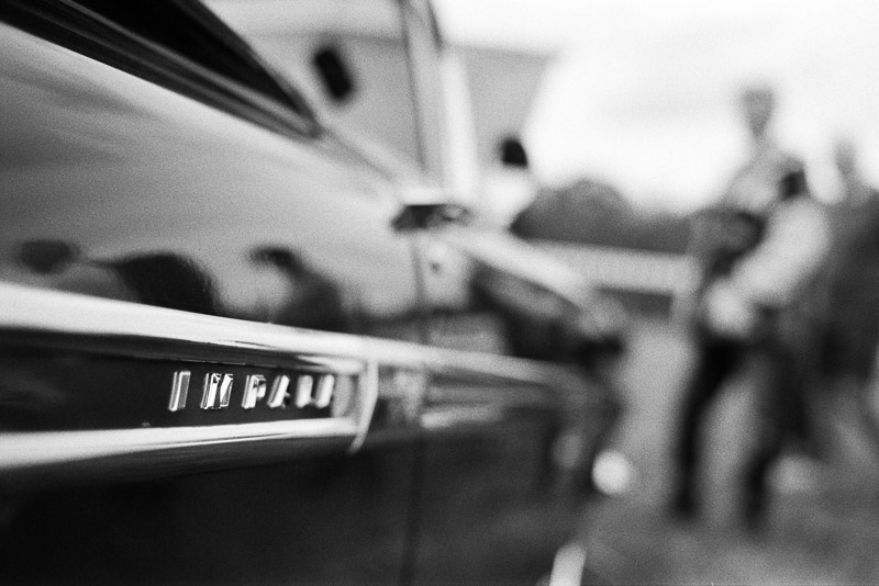
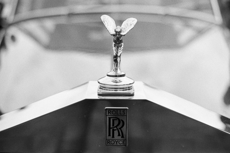
The atmosphere was a gift for Tri-X. Its grain and contrast carried the metallic shine of polished chrome just as well as the grit of worn tires.
The main competitive part of the event is Prins Bertil Memorial. It’s not a speed race but a “regularity race” (rally).
I found myself moving between the cars and the people—because the event isn’t just about machines, it’s about the joy they bring.
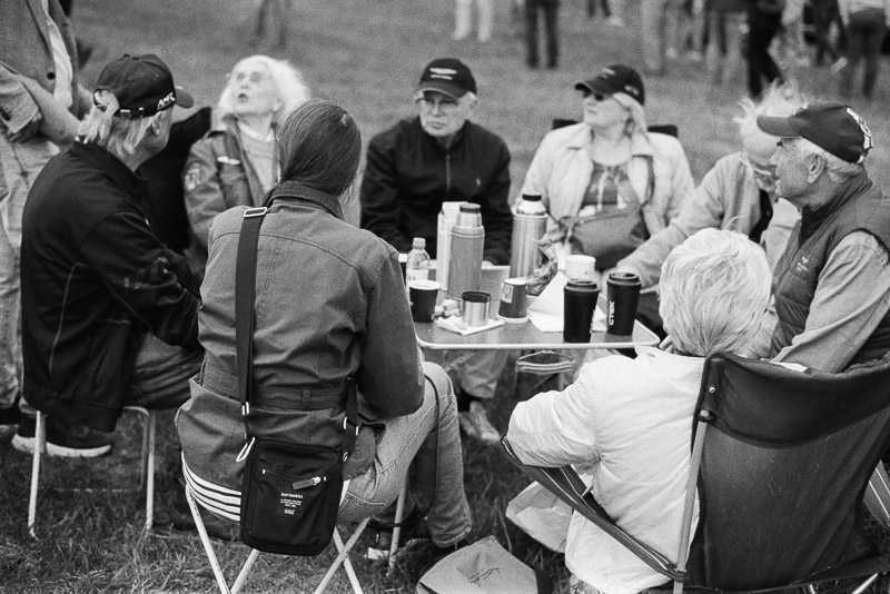
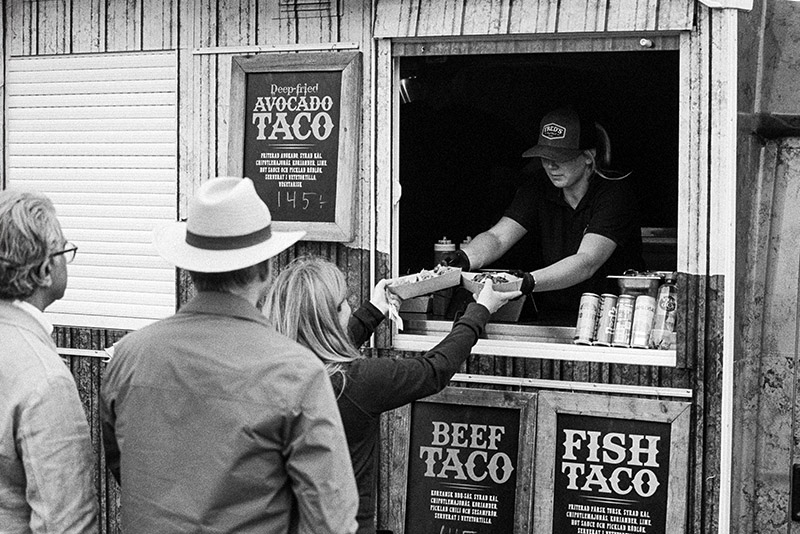
The Gärdesloppet features exhibitions of classic vehicles, food trucks, and other entertainment. There’s often a soapbox derby for children, providing an opportunity for the younger generation to get involved.
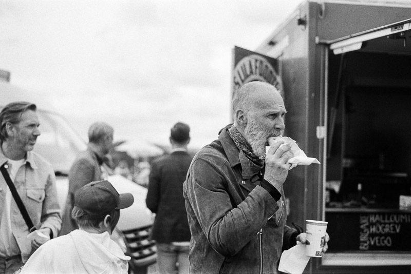
Walking through the exhibition, it was easy to see why this event has such a strong pull. Tri-X, with its bold contrast and timeless grain, seemed made for capturing that energy.
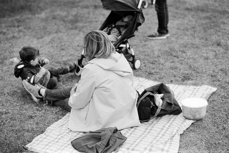
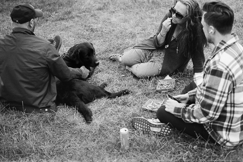
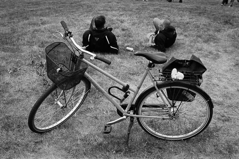
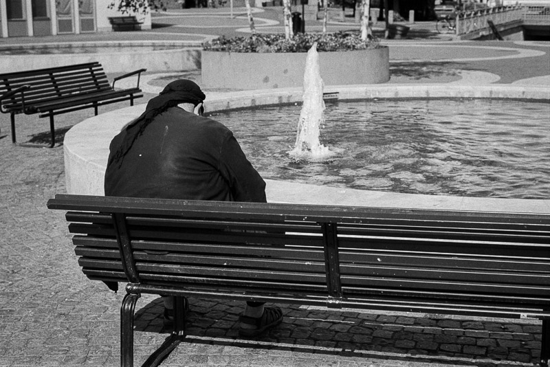
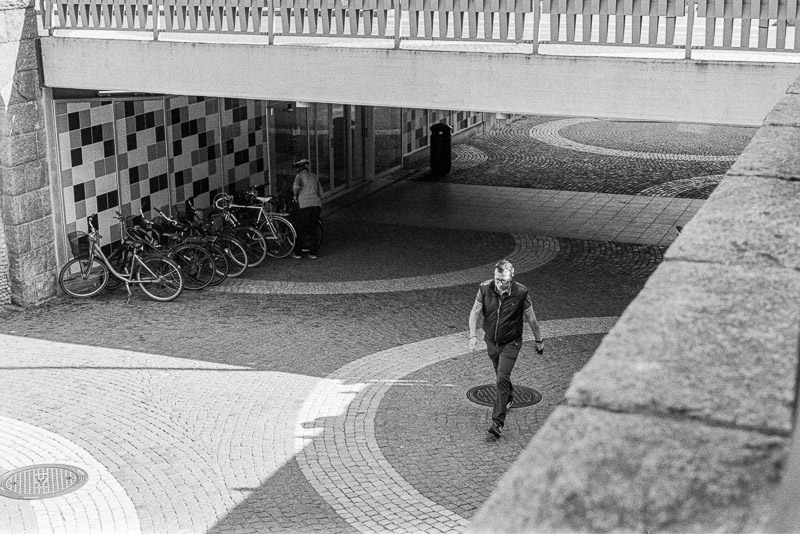
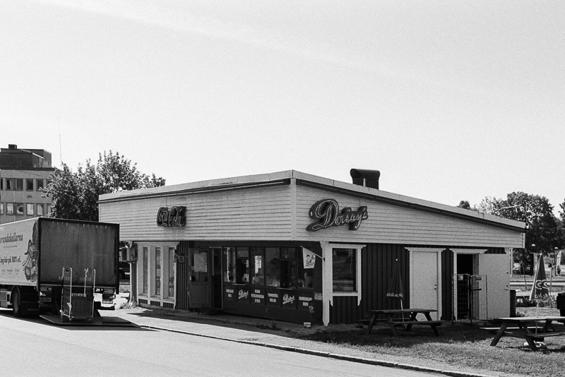
The Shopping Centre
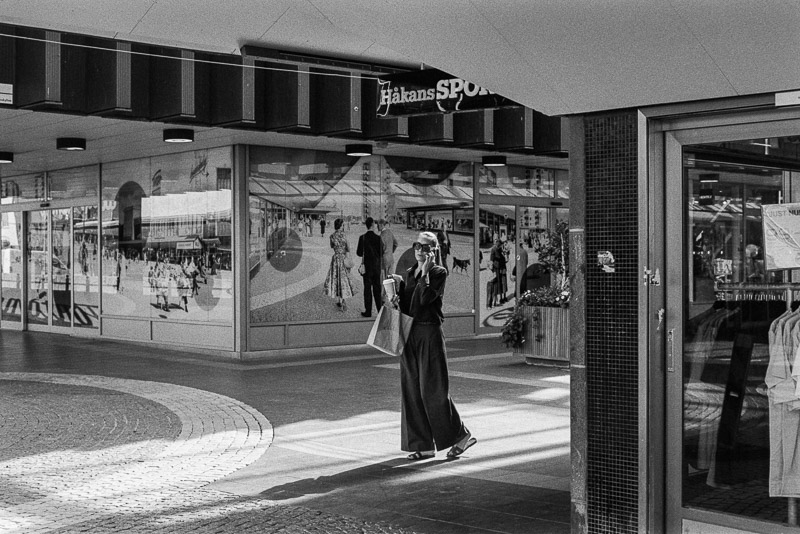
Later, I shifted scenes completely—from roaring engines to the hum of daily life at a suburban shopping centre. Here, the pace was different, but just as compelling.
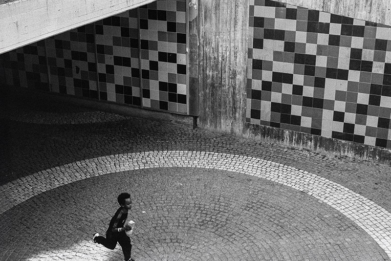
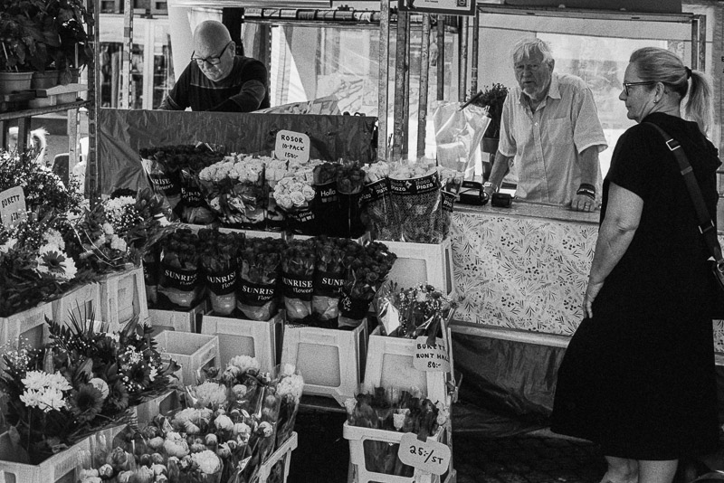
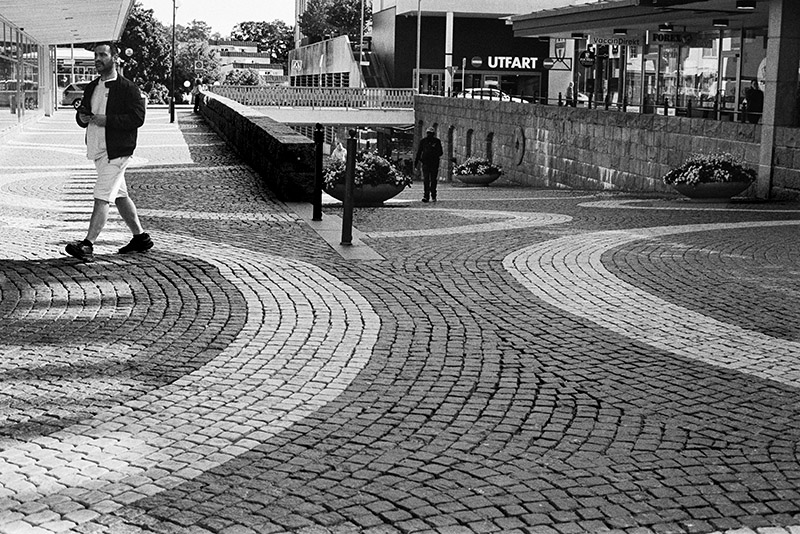
Tri-X thrives on contrast and texture, and I found it in storefront reflections, silhouettes, and the quick expressions of passersby. Everyday moments turned cinematic through the lens.
This roll reminded me why Tri-X has such a legendary status. It doesn’t just record what’s in front of you—it shapes it, giving weight and mood to the ordinary and the extraordinary alike.

Whether at a historic car race or in the flow of suburban life, Tri-X pulls it all together with that timeless, documentary feel.

All the good things about Tri-X said, I have to admit I’ve always been of two minds about this film. I like the look, and I know many photographers love it — and yes, I’ll probably catch some grief from the fans for saying this — but sometimes I find the grain a little too bold and sometimes too contrasty for my taste. For war photography, catastrophes, crime scenes, and misery, it is unbeatable. Perhaps it’s because this film has been used by photojournalists around the world for decades in such contexts, and that association lingers in my mind. For day-to-day photography, happy events, or lighter documentary work, I personally prefer other black-and-white films. More on that in upcoming articles.
For a less contrasty look with smoother grain and a wider tonal range, there’s a well-known trick: expose the film at ISO 200 and cut your development time by 20–30%. However, this also raises the question: if you’re pulling the film to get a lower speed and finer grain, why not just use a slower film in the first place? The advantage of Tri-X is its versatility. But for this roll, I just followed the standard ISO and development recommendations to show you the results.
As it turns out, the lab had developed the roll in Rodinal 1+25. While Rodinal is a capable and versatile developer, and a favorite of many photographers, a 1+25 dilution wouldn’t be my first choice for this film. That mix tends to produce higher contrast and coarser grain, which explains the look of these frames. A weaker dilution, such as 1+50—or even 1+100—would likely have delivered a broader tonal range with finer grain.
The pictures you see in this article all come from a single roll of Tri-X, shot at ISO 400 and developed and scanned by bildskanning.com in Sweden.
Writing articles like this takes a lot of time and resources. If you found it helpful or are planning to buy something online, please consider using one of our affiliate links (Amazon).
Not buying anything? If this article was useful, interesting, or helped you save money, consider treating us to a coffee (donate)!
Further Reading
- What camera gear and accessories do I use most frequently?
- Analogue Photography – Part 1: A Personal Journey into Film Photography 1/2
- Analogue Photography: A Personal Journey – Part 2 – Embracing Colours
- REVIEW: Meyer-Optik Görlitz Trioplan 50mm f/2.9 V – Soap Bubble Bokeh Treasure or Garbage?
- Analogue Adventures landing page
Support Us
Did you learn something new, find this article useful, or simply enjoy reading it? We’ve put a lot of time and resources into creating it, and your support helps us keep going. If you’d like to show your appreciation, please consider clicking the Donate button!
![]()
![]()
![]()
![]()

(Donations via Paypal or bank card)
What’s in my camera bag? MY 2024 KIT!!
- Main camera : https://amzn.to/3TsGtKg
- Camera grip : https://amzn.to/4e0G3CR
- Memory Card 1: https://amzn.to/47pA20i
- Memory Card 2 : https://amzn.to/3XHYxlZ
- Camera 2 : https://amzn.to/3Xifou8
- Camera grip: https://amzn.to/4dYYpV9
- Memory card 1: https://amzn.to/4e5h2H0
- Memory card 2: https://amzn.to/3zu7W7n
- Small travel tripod: https://amzn.to/4goIX68
- Mini tripod: https://amzn.to/4e09XXX
- Small shoulder bag: https://amzn.to/47tPMiY
- Medium shoulder bag: https://amzn.to/4ej4bjY
This site contains affiliate links, for which I may receive a small commission if you purchase via the links at no additional cost to you. This helps support the creation of future content.
Martin
Latest posts by Martin (see all)
- Review: Nikon Z 24-200mm f/4-6.3 - March 22, 2026
- Analogue Photography: Part 6 – Kodak Gold 200 - March 11, 2026
- REVIEW: TTArtisan Tilt-Shift 17mm F4 ASPH. - March 4, 2026
As someone who used TX400 almost exclusively for many years (mostly 6×6), I have to say (and please don’t take offense) that the images look exactly like they are: exposed at box speed and developed by a service provider. I find the tonal values quite poor. You should expose the TX400 more like 200 or 250 ASA, develop it a bit flatter (preferably in D76 1:1 with a gamma of max. 0.6), and then adjust the positive contrast in the darkroom (or LR, if working with hybrid) depending on the lighting conditions during shooting. You’ll be amazed at the difference it makes. TX400 is a fantastic film, but only if you handle it correctly. This is my personal opinion based on experience.
Thanks for the tip — I can see how filters and alternative processing open up a lot of options, and I’ll try your recommendation to see how it compares. That said, since any film processed outside its standard recommendations will shift the results, I wonder if it really makes sense to look up experimental processing methods for each film just to achieve a certain look.
One of the main reasons I use this film is its speed. If I wanted a smoother rendering at a lower ISO, I’d probably go with a slower film instead. Also, the aim of this article series is to show how each film looks when used as recommended, so readers have a consistent baseline before experimenting further.
By the way, in your suggestion, how much should the development time be extended/reduced to achieve gamma 0.6 with D76 at 1:1?
Well, in the end, it’s a matter of taste, of course, and nominal sensitivity should be seen more as a guide, since the actual sensitivity also indirectly depends on the development or the desired gamma curve, which in turn should be based on the subject contrast. After all, there has never been a standard process like with color negative or color positive, if you leave aside films like XP2 and similar. I personally bought a large number of films from the same batch and tested them according to the zone system for my enlarger and paper. This takes time, but you’re happy with it again with each film. But trying to explain all this stuff here would be madness. There’s an age-old photographic rule for the negative process: Expose for the shadows and develop for the highlights. This still applies today. Of course, you have to make compromises with film, unlike with individual negatives, but exposing for a little longer and developing for a shorter time is almost always the better solution, except for very low-contrast subjects. Shadows without detail and/or blown-out highlights can’t be salvaged afterward. Increasing the contrast in the positive process, if necessary, is always possible. But as I said, that’s going too far here.
Please include the development time change in your suggested process for achieving gamma 0.6, since I’ll be trying it. While I found out that approximately 20-30% reduction of the development time is the rule of thumb for your suggested approach, it would be interesting to know about your experience.
And one more small note. Today’s TX400 doesn’t have much in common with the original Tri-X from the 1950s, other than the name. It’s been modified several times since then. And another tip: A bright yellow filter separates tones better in many situations. The degree of separation depends, of course, on the subject and the lighting, but since a weak filter doesn’t absorb much light, you can pretty much leave it on (except for portraits).
That I knew, I was not sure if it was relevant to mention it though, as today, there is only this current version available.
Martin, I completely forgot about your question about the development time. You’ll have to experiment with the right time. I don’t know the recommended time according to the label. I’ll look this evening to see if I can find my data table with the gamma values. Unfortunately, I had to give up my darkroom in 2021, so I don’t have it handy. However, I can tell you that I usually expose the 120 film to ASA 250 and develop it in D76 at a ratio of 2.2 + 1 (with distilled water) for 10 minutes at 20 degrees Celsius, tilting 7 times every 30 seconds, in the 1500 JOBO tank. But that can be different with different water, 135 might be different from 120, one batch is slightly different from another, there are many variables, and temperature stability is very important. I was always very meticulous and always measured the exposure and contrast with a handheld spot meter, but I also usually shot from a tripod. But as I said, it all suited my workflow (batch, motion regime, enlarger, paper). For hybrid and without a densitometer, I would probably just start with ASA 200 and maybe develop 15% faster. But that’s just a rough starting point. You have to work your way up from film to film, and ideally, do exposure bracketing. If you’re really interested in this whole thing, I recommend the book “Way Beyond Monochrome.” You see, I’m from the pre-internet era.
PS: In case you’re wondering, my 2.2+1 ratio was calculated from the fill volume of the Aponorm bottles I used to fill my stock solution and the fill volume of the developing tank. Since I determined my time myself anyway, it was only important that the mixing ratio was always exactly the same.
PPS: 15% shorter, not 15% faster. Sorry.
The nice thing about Tri-X is the range of looks you can get by varying developer/development and format. I expose at about 1/2 stop over and develop it in Xtol. It looks much different than this. I suspect this was sent out to develop (?). In my experience, the grain usually isn’t that big, but better defined. That may also be an artifact of how they were scanned.
Yes, it was sent to a lab to develop. They used Rodinal 1+25, which produces high contrast and coarser grain.
that ‘s strange. Rodinal is a fine grain developer. It should make grain smaller and finer, not coarse. It’s also developer used to lower contrast, not rise it. My guess – your lab is over developing film. uder exposure and over developing is a worst cobination, you’re loosing tonal range, details in higlights.
You’re an experienced film photographer, I’m suprised you’re not developing films by yourself. A tank and a few bottles with chemicals doesn’t take much space.
It depends on the dilution of the Rodinal.
1+25 tends to produce higher contrast and coarser grain.
A weaker dilution, such as 1+50, or even 1+100, would likely have delivered a broader tonal range with finer grain.
You will lose shadow detail with this combination. I am quite surprised that professional lab uses Rodinal 1+25 these days. Common developer used in such service is X-Tol, DD-X or similar which yields much more detail in shadows = retains the film box speed. Rodinal in 1+25 solution is far more suitable for lower speed films and larger format, 6×6 and bigger.
TX-400 is quite versatile film. You can shoot soft portraits with it and/or get harsh contrast results on the other hand. I prefered Kodak D-76 or Rodinal 1+100 with it for portraits.
But hey, it’s a personal preference or taste! What one likes no other should like also and that’s is ok. I enjoyed this part and look forward to the next one! Don’t worry and keep going with your effort. 🙂
I agree with you Jan, as I also have written in the article and in the comment, Rodinal 1+50 or even 1+100 was to prefer, or D-76/ID-11 1+1 would also do a better job.
As I had lost all my darkroom long time ago, I sent off two B&W films to a lab, this is one of them. The other one is not much better.
After this experience, I came to the same conclusion that I had come to many years ago, you want to get the result you want, you have to do control every step. I actually went and bought everything required to develop B&W films at home, including chemistry. So apart from this and the next one, all following B&W films will be developed at home.
Beautiful photos,
I am infrequently attracted to B&W photography but this is phenomenal!
Oh, Thanks a ton Scott. You made my day, this is the first positive comment I got.
I really like your pics with a lot of chrome or dark smooth surfaces. They came out great.
Good description of the characteristics of Tri-X. I have had the same experience with pronounced grain in the lighter tones and a whole lot of contrast.
I like it on a cloudy day when the contrast and grain lend a kind of sharpness to scenes that would otherwise be smooth and gray in the flat light.
It’s also good for urban exploring, cemeteries, junkyards, or locations that haven’t changed since the 60’s-70’s. It just looks right.
Not the best for landscapes. If the scene includes a lot of sky, it can look obnoxiously grainy. And instead of sharpness, what I get from Tri-X landscapes is distinctly lo-fi. My eye can’t linger on the details because they’re a crunchy mush.
I find the grain limits digital post processing. Things get unnatural looking quickly. But if you were standing in front of something interesting, chances are Tri-X will make it even more so.
Thank you Eric. The feedback on my photos has turned a corner. It’s nice to receive some positive comments today, especially after yesterday’s entirely negative ones. Yes, I agree with you on the points you have taken up.
Dear Martin. My comment wasn’t directed against your photos, but rather to point out that systematically approached and adapted home processing gets worlds more out of a TX400 than third-party processing, which always falls far short of the potential of any black and white film. And since the TX400 is the topic of the article, I wanted to point that out. No offense.
Dear Siegried,
No offense taken. Thanks for clarifying.
Very interesting article and associated information. I shot Tri-X for many years in my youth however never had the resources to control development as described in the article. Thank you for sharing the details and images with us.
You are so welcome.