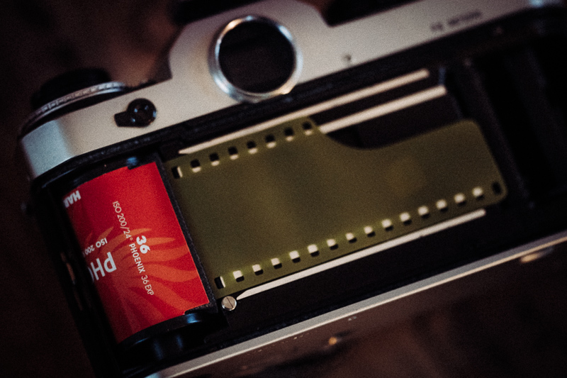
This Harman Phoenix 200 is said to be a newly designed colour negative analogue film that hit the market in early 2024. Many people did not expect anyone except for Kodak and Fuji even being able to produce a (new) color negative film, so it created quite the buzz. I am all for more competition, but I am not really sure this is the film we were hoping for, let me tell you why.
Processing (C.41) and scanning was done at urbanfilmlab in Germany. The pictures in this article are from two rolls of film.





I do have a bit of a history with this film. I exposed my first roll in Turkey, but it got badly damaged by the new airport scanners to such a degree, that the negatives became almost unusable. I contacted my lab, then I contacted Harman and indeed the conclusion was, that this film apparently is very sensitive to those new scanners.
Harman was actually very kind and sent me a handful of roles as replacement, two of which I exposed in Italy. This time there were no flights and airport scanners involved, so I was curious what the results would look like this time.
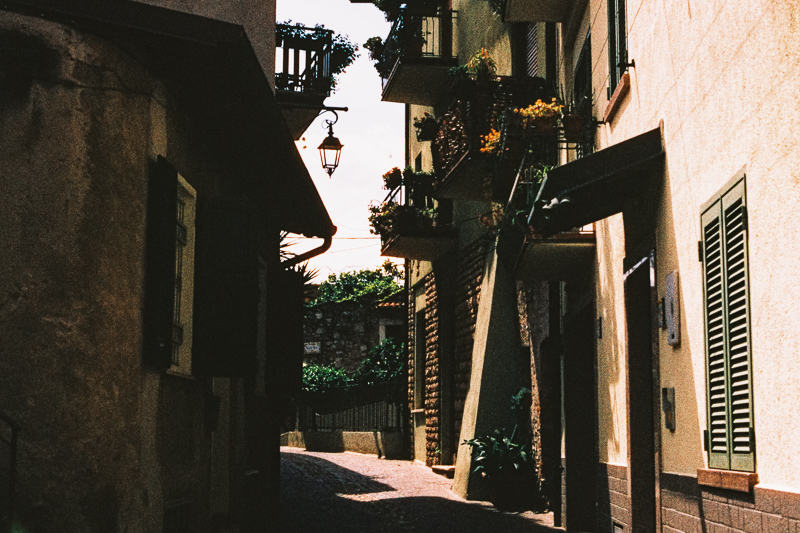


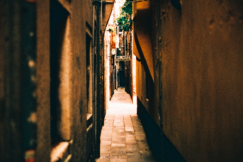
After having received the scans, I am sure this film won’t be everyone’s darling. I would describe it as high grain, high contrast/low latitude and it comes with an orangey/red color cast.
Halation is also a bit of a problem here, I think it might be even worse than what I have seen from the Cinestill 800T.
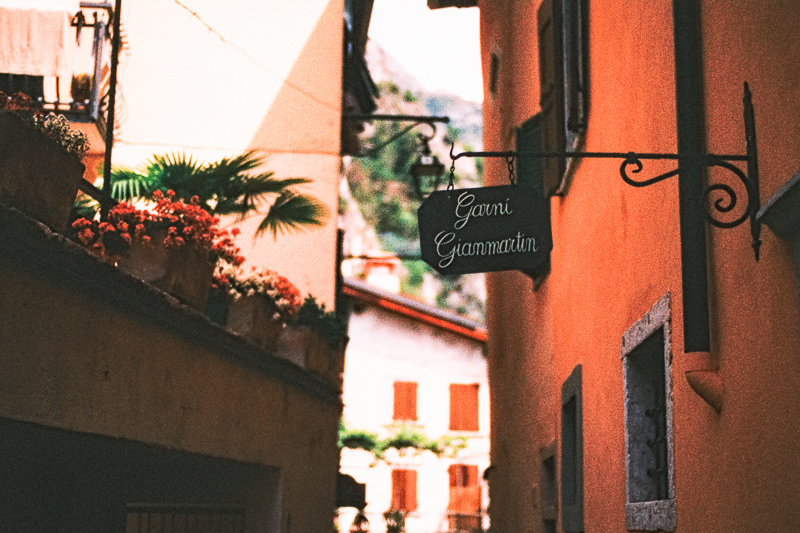


If you are looking for my honest opinion: I don’t think I am overly interested in buying more rolls of this Harman Phoenix 200. The results and colors actually remind me more of the expired films I have used and for my personal taste the grain level is simply too high and the latitude too low.
But everyone is looking for something different when shooting film, so maybe this Harman Phoenix 200 is exactly what you are looking for.




Further Reading
Support Us
Did you find this article useful or just liked reading it? Treat us to a coffee or a roll of film!
![]()
![]()
![]() via Paypal
via Paypal
Latest posts by BastianK (see all)
- Analogue Adventures – Part 50: What I learned from Shooting Film (so far) - March 18, 2026
- Review: 7Artisans 75mm 1.25 II - March 14, 2026
- Review: Irix 30mm 1.4 Dragonfly - March 7, 2026
Thank you for the review! Honestly this film reminds me more of the cheap ISO 800 (or so) films of my youth in the 1990s – good ISO 200 films had a much finer resolution and less grain then, not even to mention the better colours and higher latitude ;–). So this film would not be my cup of tea; it makes even your well-composed Venice photos look like tourist snapshots, which is really a waste – this is neither fair to Venice nor to your great talent for photography. However for people just looking for a stark retro look, this film could be a good choice.
Just to avoid any misunderstanding: I am criticizing only the film, not you! You did everything well, it’s the film which has ruined the shots. Best, Roman
All good, no offense taken!
And I agree with you.
I still thought it would be worthwhile to publish this article for people to know what they are getting themselves into here and to not have any false expectations.
Agree, it was absolutely worthwhile to publish your review! The people who are looking for a strong retro look see what they get with this film. Other people learn that this film is probably not the best one for them. So everybody interested in film photography profits from your article. Thank you again and all the best!
Well, it certainly gives a very distinctive look. Some of the photos almost look to me like old colorized black and white photos. Not my cup of tea, but I’m sure there are at least some people out there who would like it.
I’m not a fan of the look of this film but I will be buying at least one roll to support Harman. I plan to home develop in ecn-2. Might be able to squeeze a little more range out of it that way. Have you considered sending any rolls to Silbersalz?
If I expose another roll that is what I would do.
Very odd contrasty mess. It looks like film that’s been push-processed. Push-processed in normal chemicals with normal timing. If it were exposed at ISO 20 with shortened development times – could it have a normal contrast range? Since Harman is using Ilford equipment and related technology how could they not come up with a better film this?
I’m with you in your puzzlement. When this film was announced, my reaction was the same as that of physicist I. I. Rabi when the muon was discovered: “Who ordered THAT?”
The best guess I could make is that this film is aimed at people who started out in film photography using whatever cheap/expired/off-brand rolls they could find, and now are disappointed that their results on fresh, in-date, correctly processed films from major manufacturers don’t look as “distinctive.” I can’t think of much to say to such people other than, “Well, here you go, then…”
When I dared voice that opinion in photo forums, I was pounced on by people who felt I should be kinder to poor little Harman and show gratitude that any new films were being introduced at all. I don’t understand that either — Harman Technology Ltd. is a big company, Ilford’s corporate parent, and it does seem as if they ought to be able to do better…
I hesitated to add my subjective “mustard” to the comments, but I want to do this film justice, at least from my perspective (smile). The objective criticisms already mentioned by others are valid, but … I really like the images, I find the look and mood very appealing.
There are enough films that deliver a naturalistic, technically better result, but after all these decades I find this mostly just boring.
This film gives you a chance, when the stars are lucky, to get images that you wouldn’t have been able to get otherwise.
I think some of these pictures by Bastian are very, very pleasing and by no means a wasted opportunity.
Note: you could adjust the contrast a little softer when scanning or afterwards in the image processing program, perhaps this tweak could give this film a more accepted look, so it can be better appreciated.
It seems like a lot of photo labs really struggle with scanning this film in their workflows. I’ve found that rating the film at 125 speed and then scanning using a camera and macro lens (e.g. valoi easy 35) gives much better results that look a more like contrasty slide film without any weird colour shifts. Maybe give it a try if you have access to camera scanning equipment!
I believe making a colour film to be extremely technical and difficult. This film is perfect for the “Instagram” era.
I tried a roll of phoenix a few weeks ago and came to similar conclusions (including my instagram for anyone interested in more example shots). It’s a bit of a light vacuum – if I shoot it again, I’ll probably overexpose it by a good two stops and simply accept the halation because the shadow detail is abysmal. It’s not an uninteresting film by any means, but certainly an acquired taste; I’d be interested to see how it performs once I know it a little better and play to its character, because it certainly can’t be used as an ‘everyday’ sort of film. You’ve got to want the high contrast, bold colours, inflexible latitude and ‘crunch’ of the grain.
Excellent review. As you mentioned this film is for someone who wants that look. Which in a way is a good thing (albeit I am sure Harman would have preferred it to be ‘normal’) because there are plenty of ‘normal’ films out there.
After having shot a roll, I’d use this film for a very specific purpose/shoot where I want a high contrast, grainy, blocked out shadow, orangey tone look. I can see using this for gritty, stylized model shoots.
I almost want to buy a bunch of this original stock and freeze it while it lasts! This look will disappear in the upcoming/improved versions as they work out the kinks.
You can make that look with any digital file – why not use a film or a digital camera that can give you normal results that allow the occasional step into black-shadowed hyper-contrast? Would you want Phoenix loaded in your camera when you see something that cries out for normal contrast and delineation?
I am actually not sure you can make a digital file look this bad with little effort…
Bastian’s experiments with different films in out there are very intereting for those who want to use film with their film cameras. Whether a persone likes the effect or not “with a particular film” is very subjective.
I think the photos are beautiful and very artistic looking you’ve got to look at it in an artistic way that’s what films all about
I’m especially green when it comes to film photography, and prior to this, utterly spoiled by 2010’s digital cameras, and now a modern 50mp cellphone camera. Despite pricing out most beginners, I suspect that anyone who’s looking to pick up a film camera these days is looking for the authenticity of imperfect analogue media. It’s the same as digitally produced music adding in record fuzz or tape hiss, sometimes is just feels nicer to have something that’s characteristically imperfect.
Thanks for reviewing this film, Bastian. Saved me $15.
That is sometimes what I am here for.
I know this review is a year old now but in a world of perfect lenses and almost noiseless 100mp+ digital bodies, I can’t help but be drawn into the images created using Phoenix 200. Each to their own of course but I’m pleased to see a new colour film with its own distinct style.
If you enjoy the colours but not the grain so much, it’s worth trying a roll in 120.
Some lovely sample images. Thank you.