Introduction
I received quite a lot of feedback on my Leica M10 review especially regarding the B&W pictures – of which there were clearly more than there are usually to be found in my other articles – and I was asked to write a piece on how I process my B&W images. Then in the Voigtlander VM 35mm 1.2 III review people asked how I archive that vintage/film look, so I decided to combine both in one article.
Contents
General Remarks
Background Information
Unlike David I have not been shooting analogue B&W film and I also have little interest in doing so, as that would mean having to fiddle with color correction filters all the time. Same would also apply to a digital B&W camera; the slight benefits in resolution and dynamic range over a color bayer array sensor could never outweigh these massive disadvantages to me.
But even if you are in the same position: it helps a lot to get some understanding on “pure” B&W photography even if you only want to convert your color images. I can personally recommend two books on this topic: “The Essence of Photography” and “The Art of Photography”, both by Bruce Barnbaum, cover these topics in great detail and understandable even to those who did not grow up shooting B&W film.
Software
There are endless ways to edit your images. I do almost all of the editing in Lightroom. Not because I think it is the best software out there to do it (I don’t know which is) but because it is the software I have most experience with and can get to the results I want with relative ease.
But this also means that some parts of this article may be less useful to you if you are using a different software to process your images.
There are no presets here
Many people will try to sell you presets for more or less money (some are also free). Their advertising will claim they will easily give your pictures the “best”, “timeless”, “unique”, “high-quality”, “authentic”, “stylish”, “modern”, “retro”, “vintage” look that you want.
Yeah, sorry. It doesn’t work like that.
I did gather/create some presets for myself but they are often merely a starting point. Furthermore, a preset may work well for lens A on camera B but can give completely funky results when using lens C on camera D.
Also, the input is important: if you took a dull, low contrast picture no preset will turn it into an amazing high contrast one and it will be similarly hard to get a soft boudoir look from a scene with harsh light.
Camera and lens don’t really matter
Leica and Fuji fanboys won’t like to hear this, but when editing pictures to get a certain look it doesn’t really matter what lens or camera you are using. A slight change in white balance, hue or contrast is often enough to even out these differences.
To me the actual problem with all these color science discussions seems to be this: many people don’t know what they actually like or want. They may be able to tell they like pictures taken with their Olympus camera more than those taken with their Panasonic, but they don’t manage to see what these differences actually are.
If you know what you want it is pretty easy to edit pictures accordingly, so better spend time finding out what you like, instead of trying to make your Sony files look like Canon files.
Nevertheless: if you want a soft look in your portraits you may not want to use your super high resolution macro lens and if you want tack sharp, contrasty landscape shots you may not want to use your 40 years old hazy wide angle lens. But I guess you already knew that.
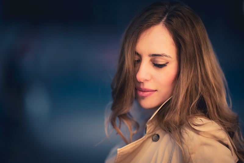
Black and White

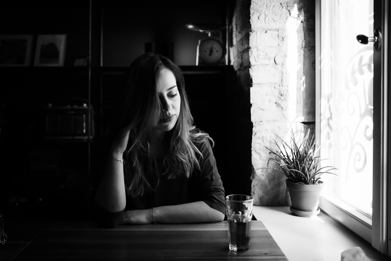
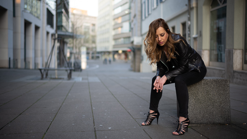
Leica M10 | 7Artisans 28mm 1.4 FE+ | f/1.4
With black and white pictures I often go for high contrast with clearly defined blacks. Some of today’s cameras allow you to recover the dark parts of your image with ease, but this is not necessarily something you should always be doing. I prefer to direct the viewer’s eye to the interesting parts, and the dark parts sometimes aren’t that interesting.
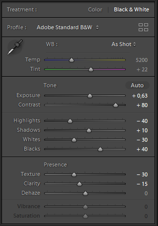
In this picture I want to increase the contrast, so it is obvious to start increasing it (+80), when you do that the dark parts can become pretty dark, so I light these a bit (shadows +10, blacks +40) and also the highlights were too blown out, so I reduced the exposure here (-40).
The 7Artisans 28mm 1.4 I was using here is actually a pretty high resolution lens, so I reduced structure (-30, gives smoother skin) and clarity (-15) here, for a slightly softer look.
Of course I also adjust the global exposure, if necessary.
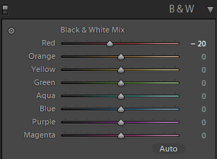
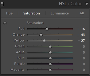
The “Black & White Mix” is a very mighty tool: it gives you the opportunity to use any kind of color filter in post.
What I often do is make the blue darker for a more dramatic sky in landscape/architecture shots and sometimes with portraits make the red darker, so that lips stand out more (which is what I did here by dialing in red -20).
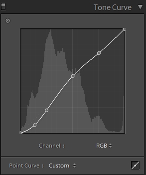
Sometimes I also adjust the tone curve a bit. Even small changes can have a big impact here, so you need to be careful what you are doing.
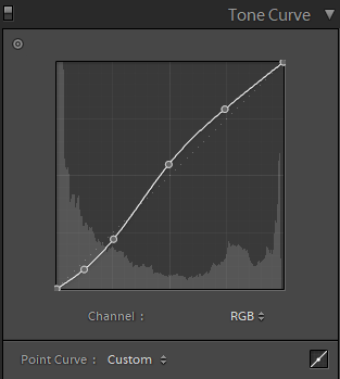
For this picture I used the “medium contrast” setting as starting point and then further increased the exposure on the midtones and reduced it on the darker parts, which further adds to a more contrasty look.
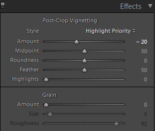
As I cropped the image to 16:9 – by which I cut off the original vignetting of the lens – I also added post crop vignetting (-20).
Sometimes converting an image into black and white can also save the day. Especially as wedding, concert or reportage photographer you cannot always control the lighting and every now and then you will run into a situation where there will be lights with different color temperatures in the frame.
Evening out different color temperatures in a single picture can be a tedious, sometimes next to impossible task.
After a conversion to B&W this is usually not a problem anymore, therefore I often use a B&W conversion here to “rescue” an otherwise not usable picture.


Vintage Look

Leica M10 | Voigtländer VM 35mm 1.2 III | f/1.2
When it comes to “film” or “vintage” look everyone will think of something else. For some it is just a high amount of grain, for some it is a desaturated low contrast look and then for some it means not so neutral colors.
Personally, I get nothing from increased noise (or grain), but I sometimes like slightly alterated colors and a less contrasty look. The picture on top of this chapter is an example of this and I will tell you what I did in post here to archive that look.
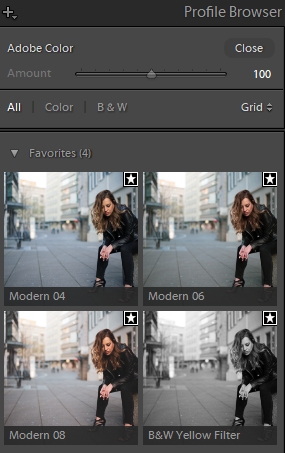
A few updates ago Adobe introduced the “Profile Browser” to Lightroom, imho one of the most useful additions lately. Essentially these are presets, but unlike presets you can easily adjust the strength of the effect and there is a nice overview of what the different profiles will look like in small thumbnails.
Often when there is a picture I don’t yet know how to process I just browse through these profiles and see what fits.
Actually, many I don’t find particularly useful, but “Modern 08” I use frequently, as it is a good starting point for that look that we want to archive here.
Modern 08 has been used for all the color pictures in this article.
Modern 08 reduces contrast quite a lot, so I increased contrast (+60) and make some further adjustments to Highlights (-75), Shadows (+60), Whites (-30) and Blacks (+70). And also make similar adjustments to the tonal curve as in the B&W picture.
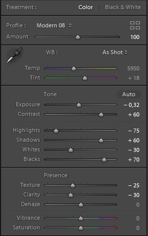
Reduction of Texture (-25) and Clarity (-30) were added for softer skin and softer overall look (especially in the out of focus areas).
Often I make local adjustments where I think they are needed. Here in the original picture the face was too saturated for my taste, especially compared to hands and feet. So I used the saturation slider on the skin to reduce the saturation a bit.
The Voigtlander VM 35mm 1.2 III vignettes so much at f/1.2 that even after cropping to 16:9 no post-crop vignetting was needed.
You remember how in the beginning I said camera and lens don’t really matter here?
I have a shot from the same scene with the Sigma 35mm 1.2 Art on the Sony A7rII. Different camera, different lens.
At first a Before/After comparison again:


Sony A7rII | Sigma 35mm 1.2 Art | f/1.2
I used exactly the same editing as before, with these minor changes: Temperature -200, Tint +2 (as the Sigma/Sony picture was slighty warmer and greener), Contrast -20 (Sigma is contrastier), Post-Crop Vignetting -11 (as the Voigtlander has stronger vignetting than the Sigma).
Here you can see both in direct comparison:
Before: Leica M10 | Voigtländer VM 35mm 1.2 III | f/1.2 | After: Sony A7rII | Sigma 35mm 1.2 Art | f/1.2
You can still try to look for tiny differences, but to me the look is pretty much the same.
Sidenote: when going through the pictures from this set in my Lightroom library I always have to check the Exif to see what camera/lens combination has been used for a given shot…
Final remarks
I tried to show you here how I edit my pictures to give them a contrasty black & white or a “washed out” vintage look.
Processing your images is a matter of taste, and even if these styles of editing don’t meet yours, I hope I have still been able to show you some tool in Lightroom that you haven’t been using before and that might prove useful to you in the future.
I also have articles here how I processed a blue hour cityscape and a milky way picture.
Further Reading
- Sony FE lenses: Our comprehensive and independent guide
- Guide to portrait lenses for Sony FE from 85-135mm
- Review: Sony FE 85mm 1.4 GM
- Review: 7Artisans 28mm 1.4 FE+
Support Us
Did you find this article useful or just liked reading it? Treat us to a coffee!
![]()
![]()
![]() via Paypal
via Paypal
Latest posts by BastianK (see all)
- Review: Nikon Nikkor 50mm 1.2 Ai-s - July 4, 2026
- Analogue Adventures – Part 54: Kodak Ektar 25 (expired) C-41 - July 1, 2026
- Review: Sigma 14mm 1.8 DG Art - June 27, 2026
Always a pleasure peeking into someone else’s workflow for ideas. Thanks for sharing!
Great review! I really appreciate the tips look forward to using them.
I recommend trying the C1ick Match film profiles. They are really a great starting point, and abundantly useful.
I admit, perhaps because I shoot more landscapes than anything else, I never really thought of decreasing texture and clarity in portraiture (possibly because the thought of making a photo “less sharp” has been ingrained as anathema in my head, now that’s something that surprised me), I’ll definitely have to get back and look at in the few portraits I’ve taken.
Agreed on the whole though, just look for what you want/like and do it. I usually love contrasty landscapes but when back in the autumn I visited an incredibly beautiful lake, I found myself lowering the contrast in almost every photo, because I just liked the look they gave much better that way.
People who harp on about colour science either are ignorant of, or refuse to acknowledge, that the major reason of how a raw file looks on our screen is due to what the software manufacturer (Adobe, CaptureOne, you name it) decides, rather than the camera manufacturers themselves. Not that I ever understood all the whining about skin colour when it takes a few seconds to make any file from any camera “look like a Canon photo” (whatever that means, too). Your Sony/Leica shot is ample proof of that, I know if they asked me to guess which was whose, I’d just do it with eenie miney moe.
As a Capture One20 user, I also find the Lightroom advice on sliders to be just as useful, the two softwares have grown relatively similar so seeing your postprocessing was still helpful ^^ thanks for that and this whole article, cheers!
Interesting to know that Capture One sliders are so similar, good to know 🙂
lately i started using C1 as an addition to LR, mostly because they offer a cheap (around 100EUR when on sale) perpetual license of their Sony version.
I find the color tools easier to use in C1 than in LR, apart from that, everything else it’s quite similar to use once you’re used to it.
In terms of results i have to say it varies from image to image what output i like more, when i process an image in both LR/C1. Actually, results can looks quite different even if i have a certain look in mind.
But i woulndt agree with those people that say LR is for fast retouching and C1 for when it’s ought to be good.
Have been waiting for this for months-
thank you Bastian!!
Gorgeous images as always and love your workflow approach to the b/w toning down.
Read your old article on the Brenizers and want to combine that with B/W using your workflow.
Thanks again for this, much appreciated!
You just made me aware I never processed a Brenizer in B&W, I will also do that in the future 🙂
Thanks for that Bastian.
Interesting you pump up the contrast so much then try to reduce that by upping blacks and pulling whites down, will have to experiment that versus just pulling down blacks and upping whites. I thought they might be similar??
Re colour, I do recall your article about shooting with the Fuji that you remarked “there is indeed something special about the Fuji colours”. I shoot both Sony and Fuji and find it a LOT easier to get what I want with the Fuji RAW files. Not all the time but the majority for sure.
Lastly, as an aside, amusing that your first shot is very, very similar to a shot I made a few days ago, also with a Voigtlander (E mount 50 f1.2). It is this lens (my only for the Sony!), bought thanks to this website haha, that stops me from selling the Sony!! If you’re curious as to the shot it’s third shot back on http://www.instagram.com/pthysse_landscapes
There are different ways to edit of course, but I think the midtones look quite a bit different when just pulling down blacks and upping whites.
Fuji article wasn’t by me 😉
Your picture is indeed very similar in every way 🙂
Thanks for the article!
It is nice to see the methods you use to get the look. I use capture one as well and the one difference I see between lightroom is the lack of the sliders for blacks and whites.
I’m probably a lot more heavy handed in messing with the individual color sliders which I tend to use to bring out contrast in an image when there isn’t as much tonal contrast to begin with other words a photo which isn’t really a good B&W candidate.
The other item I tend to use is what I call collapsing a curve, meaning if there is a gap between the start or stop of the histogram and the curve from the photo, I would then try to slide the last point to where the curve ended to increase lights or darks.
Bastian’s 2nd tone curve image is one where it looks like the whites stop at 215. I might try it to see how it looks to put the last dot at the top where the curve ends which has the result of bringing items there to 255 or true white.
wouldn’t that lift the highlights even more in the mid/top part of the image, that would probably be more distracting than helpful.
S.B. – it would that’s why I said I might try it to see how it looks. I’m not going to say that it is right or wrong for that one image, just another possibility to try.
Hello,
thanx for sharing your techniques!
Is it possible to provide raw files of this photos, so it would be possible to compare my presets and workflow results?
i find it quite interesting to see how the RAW processing is done, i’d like to see this more often, also on landscape photos.
Thanks for tips. However, it’s strange, but I’ve got Modern 8 very contrasty with slider at 100 and with +60 contrast it looks awfull. The profile looks quite different at all. (A7 III + Samyang 35/2.8)
Greetings from Tschechien 🙂
Thank you very interesting
Thanks, Bastian! Great tutorial. I love your point about the different manufacturers’ looks being replicated by some quick postprocessing.
For editing, I use RawTherapee since it’s free and fully compatible with linux. It doesn’t have a perfect correlation to LightRoom controls (is “texture” or “clarity” the same as “Local Contrast?”), but it seems that it can do most/all of the same things. For those who are budget conscious, I would definitely recommend it.
On a side note, RawTherapee can use “film simulation” libraries that attempt to replicate the look of analog film stock — for example, Fuji Superia 200 ISO or Kodak Ektachrome 100 VS. Maybe this is functionally similar to the LR Profile Browser you mentioned. For black and white, I prefer to do the editing myself, but for vintage color editing, I find these presets to be a nice quick shortcut.
Thank you for this article! Stumbled upon your website a while ago and must say this is one of the best and most useful photo websites out there. I use LR and several plugins such as Nik Silver Efex for B&W, but it seems LR allows subtle changes with pleasing outcome if done right!
Thanks for sharing your workflow, Bastian. I’ve mostly been shooting with a Fuji X100F lately and I usually just use the JPEG engine with that camera. There’s a guy that runs a Fuji blog (fujixweekly) that has created recipes for the different Fuji simulations that I like a lot. It has cut out almost all of the time I spend editing, and for my everyday casual shooting, this is ideal. Some people really love editing images but I am not one of them.
I was about to write that several images are missing, but then pasted the link to this article in my other web browser (Microsoft Edge), and then the before/after images are visible. My message here is that those before/after images aren’t visible in the current version of Mozilla Firefox (110.0.1), in case there is something you guys can do about that (how the website is set up).
There is something I can do about it, will do!