You sent us over 30 images of which we have selected a few and will show our edits in the coming days. Thanks a lot for the images. To be honest I (Phillip) lost track of who sent us this lovely file. Please let us know and also your thoughts on our edit :).
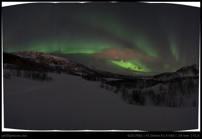
Phillip’s edit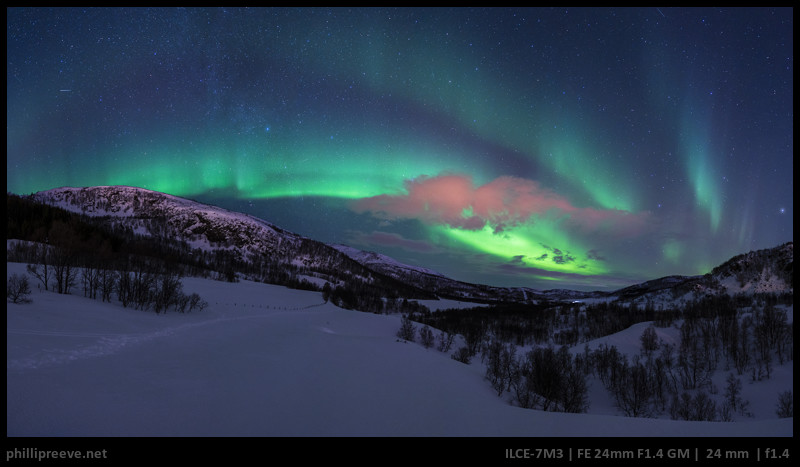
To be honest: I have never seen the aurora with my own eyes so I allowed myself a little more artistic freedom with this edit. I went for a very vibrant image with a saturated colors and a cool blue sky. I also let the snow go somewhat blue to emphasize the cool night even though I reduced saturation of the foreground a lot.
My settings are very basic and they would have been over the top for most daylight scenes. If I compare my results to those of the others they might be over the top for this one as well.
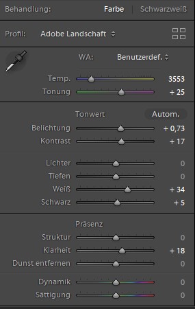
I also cropped out some of the foreground because I felt it added nothing to the image.
David’s Edit
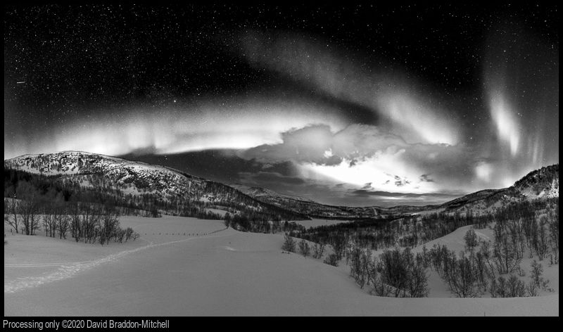
I decided to make a monochrome version of the image, because the shape of the aurora was a striking part spiral which would be more graphic in monochrome. I’m also a bit bored by all the green aurora images on the web!
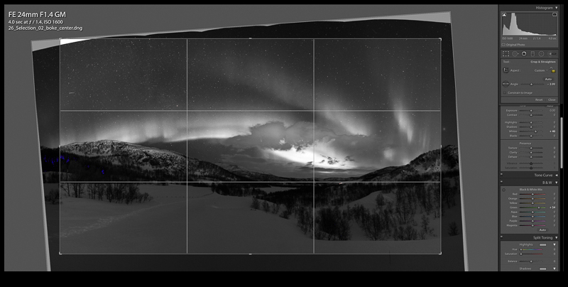
I began with the basic conversion in LR. Here I cropped the foreground and rotated the image to get the trees straight and the spiral looking good. I also increased the luminance of the green channel, which made the aurora stand out more:
I then moved the image into Photoshop. Black and white images often benefit from changes in local contrast: you want to make tones seperate in just one part of the image. Until Lightroom introduces curves as a local adjustment tied to brushes, this requires going to Photoshop.
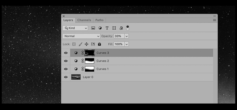
Thee three basic curves layers account for all the difference you ca see between the lightroom image and the final one. The top layer is just a very minor tweak to enhance the contrast in some of the snow texture. The main ones are the next two: the middle layer separates the tones of the snow and the trees, and with the bottom layer I held the brightness of the stars fixed, and dragged down the curve to make the sky blacker. Then the image was passed back to Lightroom for a very minor levels tweak before posting!
Juriaan’s edit
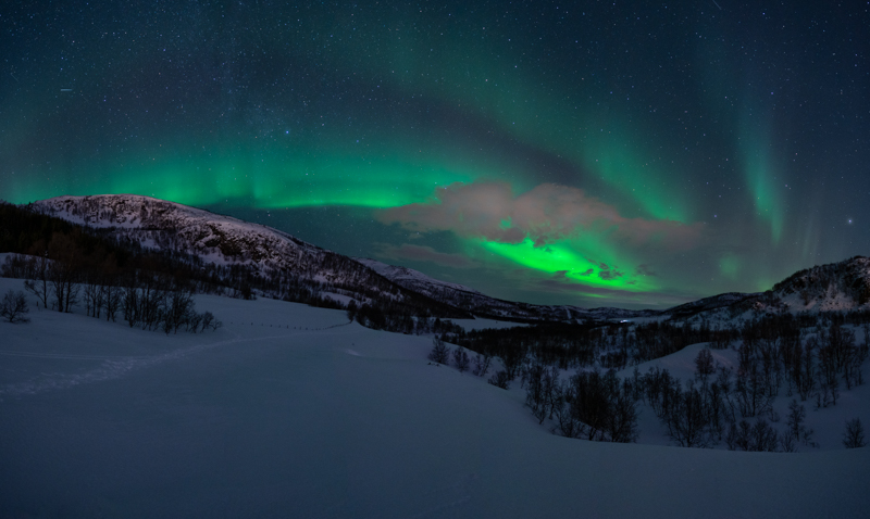
I started with ajusting the white balance in Lightroom. I shoot the milkyway regularly and I like a relative cool edit usually the most. Therefore I decided to edit this photo of the northern lights in a similar way.

After adjusting the white balance in lightroom I opened the picture in Photoshop to do several local adjustments. I used the free plug in TK basic panel V6 to easily create luminosity masks. This is an easy way to apply certain changes only at light or dark regions in the image. See the “lights mask” below, white parts are affected 100% black parts 0%. The grey tones in between are affected gradient wise, light grey is affected more than dark grey.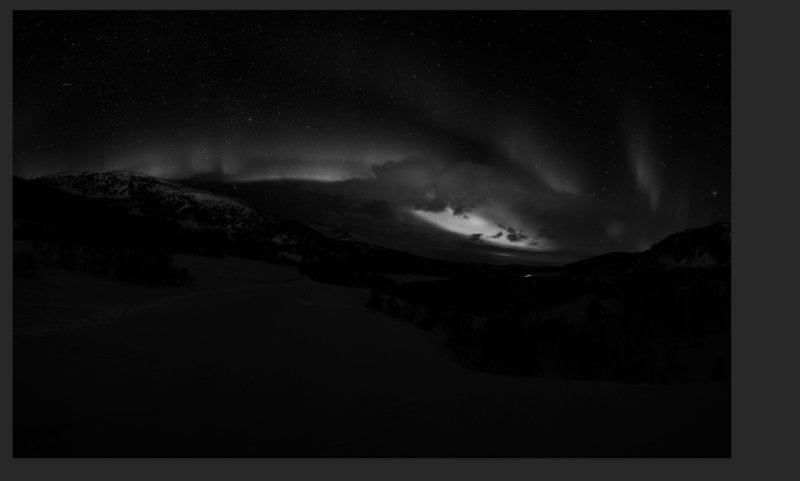
I manly used some simple curves to improve contrast in certain parts and to make the snow look a bit more blue. I also used a curves layer to mitigate the effects of light pollution on the cloud in the center of the frame. I also removed a few items like an annoying stick in the foreground.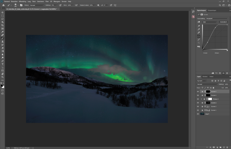
After the edits in Photoshop I did some final changes in Lightroom to get the final result.
Jannik’s edit

The first basic manipulations were a cut to 16:9 format that cutted off a lot of the plain white foreground. My goal was to increase the total amount of sky in the image while keeping all the relevant compositon details. Second adjustment was to stamp out the lights of the car which was centrally in the right half of the image.
When I started editing the image, I realized quickly that the image was taken with a city or other artificial light sources in the back. The mountains and the clouds are reflecting lots of that sodium-vapor light. I felt that the feeling of nature and the focus on the colors of the natural lights were lacking due to that color, therefore I had to manipulate these colors quite a bit. I furthermore added two masks, one for the snow that was decreasing saturation and removing noise and another one for the sky that was balancing contrast and color of it. I prefer the rather plain white looking snow while keeping the blue in the sky. This emphasizes the contrast between the dark night landscape and the color spectacle in the sky.
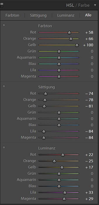
The base development is rather simple. I raised exposure with the white value and pulled the lights back. The depths were raised as well to get more information in the foreground.
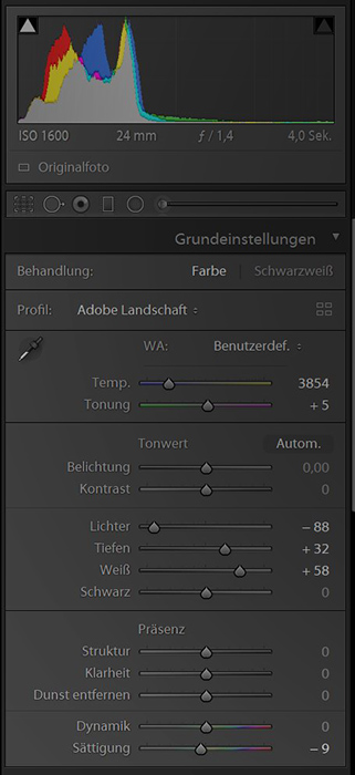
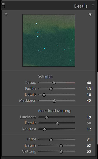
Sharpening is a tricky thing in these high ISO landscape images. I focused mostly on masking and noise reduction and increased radius a bit. I also had to decrease color noise a bit. This felt like the best compromise between noise and remaining detail in the sky.
Bastian’s Edit
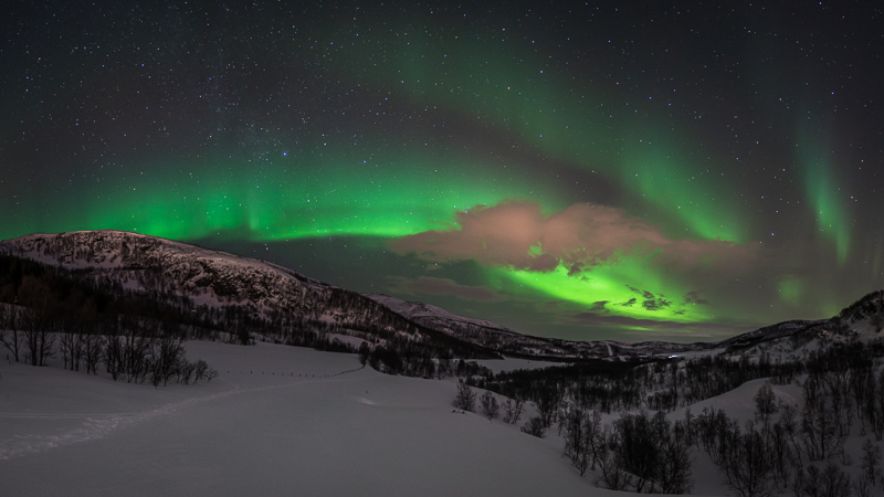
I also cropped to 16:9 format and tried to do as much of that to have the tracks in the snow as a leading line into the scene.

Editing is rather basic, I didn’t touch WB and mainly increased contrast, lifted shadows, lowered brightness.
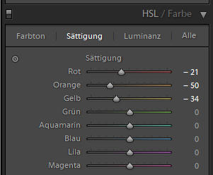
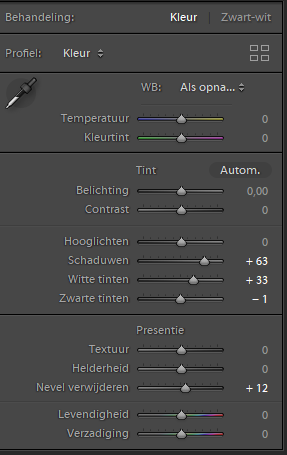
I did some local adjustments to the saturation sliders, as I felt the mountain and the clouds are too orange.
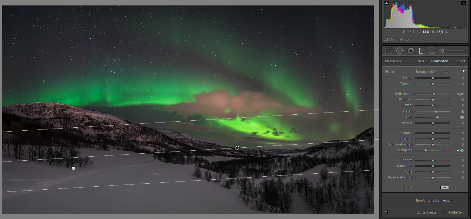
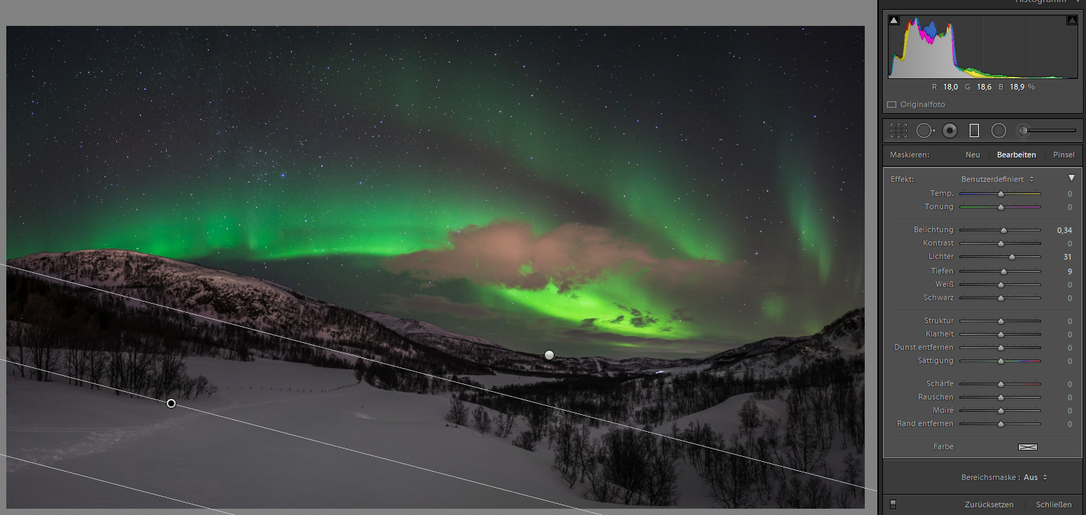
I used two gradients to lower the saturation of the snow and make it look more white instead of blue.
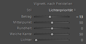
For panorama or when cropping an image I usually add a slight vignette afterwards.
Latest posts by Phillip Reeve (see all)
- Review: Samyang AF 75/1.8 FE - April 12, 2021
- The FE-List now has 113 lenses on it - March 25, 2021
- 2020 – Year’s end review - December 28, 2020
I really dig David’s B&W edit.
I like Juriaan’s edit the most. (but I’m yet to see Aurora live myself)
me2
its interesting to see how different the results turned out.
looking forward to more edits.
A very interesting comparison, and it is really informative to compare your settings – thank you very much!
My wife and I saw them in November of 2017 in Tromso Norway. The color edits are favorites. It is awe inspiring to see them in person.
Personally, I like Jannik’s edition, cause of the colors. Emphasis on Aurora, white snow. Not much more you need to show, in my opinion…
Hi,
thank you for choosing my image. I took this image in Feb. 2020 near Tromsø. Bastians version looks pretty familiar, nearly exactly the edit I did on this photo. I think 16:9 is a pretty nice crop for it and I have to admit that I really like Janniks approach of getting rid of the citylights and pushing the sky a bit into the blue colour aswell.
Thanks again for sharing the file with us. It was fun not only because it is a good image but also because it is a very solid file whichleft a lot of room for editing.
My top 3 are Bastian’s edit, the monochrome from David and Phillips’s edit. The final result differences and the different ways you approach the edit(spirals, patterns, recovery areas etc.) is quite educating.
Thank you for taking the time to do this exercise and detail of steps. Look forward to more!
I would choose Jannik’s editing. Probably it is not the most realistic interpretation but, in my opinion, it is the most balanced and artistic. I am not sure whether making green little less vibrant would make the image even more attractive. Many thanks for such an interesting comparison!
Love this concept, keep ’em coming! Very interesting to see how you guys work.
That’s a very interesting project, look forward to see more!
Agreed with everybody else, this is a great idea for a series! Thank you.
I like this “the team edits your image” thing. Suggestion: would it be possible to attach at the end of each post an array of thumbnails of the various versions? I think the reader would benefit from seeing them side by side.
Thanks, I enjoyed the edits!
Jannik and David were my 2 favourites.
are you gonna retouch the other submissions too? 🙂