Introduction
For many people shooting film is all about the grainy look and distinct colours, but do you really need to shoot film to get that? Let’s see what we can achieve with a few bucks for presets and a little effort in Lightroom.
Using presets and profiles
This article is mainly interesting for the Photoshop/ACR/Lightroom users among you, as usually such profiles are only available for Adobe software.
First we have to talk about the difference between presets and profiles though. I guess there have always been presets in Lightroom (I joined Lightroom with version 4, so I am not 100% sure), whereas the (adjustable) profiles have been added with version 10 if I remember right.
These profiles allow for a wider range of manipulations (maybe have a look at this article for more details) and come with a slider that allows for adjusting their “strength” from 0 to 200%. Unlike presets they also do not alter any of the sliders of other settings like contrast or sharpening directly and visibly.
If you search online for a film name and add “lightroom preset/profile” I am pretty sure you will find something. You can find offers with only presets, with only profiles or sometimes both in one package.
Some cost money, some are free. Generally my experience with free presets has not been that great and I found them to mainly clutter the list without being really helpful, whereas the ones that I paid money for I found to be quite decent (I checked reviews and comparisons first to see if there is an actual chance they might be decent).
Keep in mind though: presets/profiles are rarely one click wonders. While the ones I am showing you here often did a good job with the color palette and tonal range, they still need further adjustments in the contrast, lights/shadows and white balance areas – as any raw image does.
Replicating the Kodak Vision 3 look
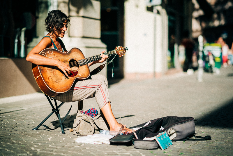
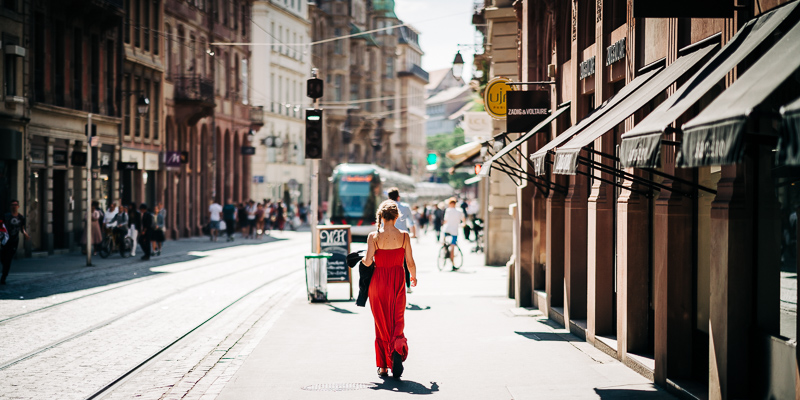
As you already know from the previous two articles of this series I have been to Barcelona and shot four Silbersalz35 (Kodak Vision 3) cinefilms with my Leica M6.
I did not do many side-by-side comparisons taking the same picture with M6, then switching lenses with M10 and taking the same picture on digital to compare them, but very often I took a picture with the Voigtländer VM 35mm 1.2 III on the M6 and a similar picture of the scene with the Voigtländer VM 21mm 3.5 on the M10.
So instead of trying to have two pictures which are the same in every regard I tried to match the general look and color palette of the digital files here to look like the analogue ones.
How close could I get? How much work was it? What can we learn from it? There are a total of eight side by side comparisons where we will discuss this.
As starting point for the digital edits I used these profiles which I bought for 26€. This is a reasonable price for 5 profiles (if they are good) considering they cost about as much as one roll of film.
And writing this article was a great excuse to spend that money without thinking too much about it 🙂


This is one where I had some issues getting the wide balance in different parts of the digital picture to match that of the film one. So in the end I used a gradient on the foreground in the digital picture to give it a less orangey look.

When looking at the analogue pictures I found the 50D film to give a low contrast look in daylight with a bit of washed out colors and this is clearly represented in the profile as well.


Now this is an interesting one as it shows the limits of presets and profiles. As you may remember from the other articles film can capture more information in the highlights, so in the film picture the light in the background shows plenty of details whereas in the digital picture it is blown out.
I could have captured the same dynamic range with the digital camera, but underexposing at least 2 stops and lifting the darker parts in post would have been necessary to do that.
No profile can recover blown out highlights and while it is a good idea to overexpose a bit with film to capture more of the dynamic range of the scene, underexposing with digital is needed.


I was thinking of switching digital and film picture here and see if anyone can notice. Or did I switch them?

This is one of the few occassions where I was using the same lens on both cameras. Again we can see more highlight information in the film picture and more shadow information in the digital one.


I was shooting in different directions here so also the light was different, but being presented next to each other, would one stand out to you as being shot on film or digital?

Even though the idea behind the two pictures is very different I wouldn’t be surprised had they been taken with the same camera only seconds apart.
Here I added gradients to make sky and sand look brigther in the digital picture though.

Now this was a very interesting one as the tonal range is rather limited in this scene to begin with.
In the end I had to add local exposure adjustments to the figure in the center to get a good match.
Not in every of these (very different) scenarios I manage to get a perfect match – it was obvious from the start, as I usually used different lenses for the two pictures. But I still think in most cases the graded digital picture is so close to the film picture, hardly anyone would notice it without knowing.
And a more important question: if I didn’t have the analogue pictures as “target value”, would this be the look I would have ended up with for these pictures?
And this brings me to the next chapter.
Strong edits and obscure films
Even for something as obscure as Kodak Aerochrome you can find pretty elaborate profiles. And when shooting digital and grading in post you have a lot of control over how strong you want these effects to be in the final image – and you can get the colors without the grain.
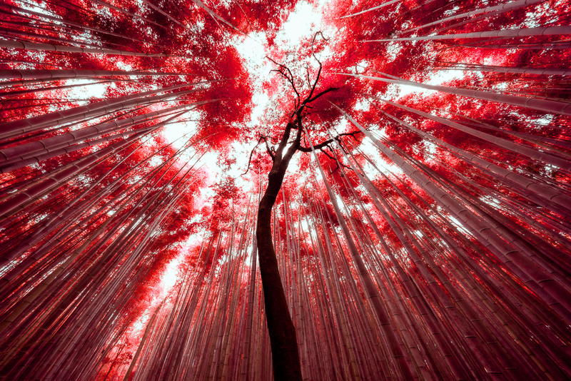
But then there is something interesting which I have been thinking about a lot lately: some of the more distinct looks that mimic a certain type of film are somewhat “accepted” today and the Kodak Aerochrome look – essentially replacing green with red – is a very good example of that.
Now if you create a profile which turns all the blues to yellow – which is not that hard to do and essentially the same thing – I am pretty sure it would be confrontated with a lot less acceptance due to the lack of a film it inherits its look from. For some reason it seems strong edits are more widely accepted, when you can find a film which looked similar.
“This looks so photoshopped!”
“No, it looks like [insert film name]!”
“Oh, in that case I just decided to like it!”
Conclusion
Do you want your digital pictures to look like analogue ones? And if so, why do you want that?
The first question you need to answer yourself, but let’s discuss the second one.
Nowadays it is technically easy to create your own look. But many people in the digital age don’t even want that, they prefer a very neutral look – even though neither commercially nor artistically this is necessarily always the right decision.
Coming up with just one look that speaks to a broad range of people is also not an easy task at all, but this is exactly the problem film makers have been throwing millions at for decades, heck, for more than a century!
So the same way the color palette Rembrandt used for his paintings still appeals today, this holds true for the color palettes of some of the analogue films (especially the more popular ones from Kodak and Fujifilm) as well.
So, why reinvent the wheel, right?
More parts from this series
- Part I: Choosing an Analogue Camera
- Part II: First Roll of Film
- Part III: Getting things fixed
- Part IV: Barcelona
- Part V: Silbersalz35 films
Support Us
Did you find this article useful or just liked reading it? Treat us to a coffee!
![]()
![]()
![]() via Paypal
via Paypal
Latest posts by BastianK (see all)
- Review: Viltrox AF 26mm 2.8 Evo FE - July 15, 2026
- Review: Sigma 24-35mm 2.0 Art DG HSM - July 11, 2026
- Review: Nikon Nikkor 50mm 1.2 Ai-s - July 4, 2026
Very interesting read that generally mirrors my own experience. I have to admit i personally feel kind of insecure when doing stronger color grading and film helps me to justify it, which is funny considering that scanning=digitizing film already introduces alot of digital enhancments (WB/color adjustment) and theres alot of heavy retouching done by every serious film photographer in post (printing/digital). So i dont see how trying to match the “film look” with a digital camera is much different from what is regularly done by everyone.
Mostly film inspires me to be more creative with my retouching (caused by trying to match the film look) since i probably tend to stay closer to reality than necessary.
But the joy of film photography is real, so i definetly see myself shooting film from time to time. But afterall digital seems more eco friendly/sustainable and cost-efficient.
Great post. Must took you a lot of time to tweak these photos, not an easy feat. I have been using DxO FilmPack software for film emulation, and results are pretty close to various types of films.
The argument at the end is an interesting one: create unique look, photographer as artists. If that’s the case, reinventing the wheel is the whole point, and why stop at film simulation?
To my the main reason of shooting on film is psychological.
While I rarely shoot films these days, I very much admire the process. The limitation, hassle, and cost of film really change the way we take pictures, in a good way.
The best way to get the “film look” seems to be to start with adapting film lenses, in my experience
Agreed!
I really appreciate all your writing here, Bastian. Especially when your thoughts about art come through in addition to your technical knowledge and experience.
Which presets/profiles did you end up getting that you thought were worth it and enjoyable to use? I have not used any of these before, but for the price it seems like it would be fun to try.
What aerochrome profile is that? I must have it.
It is from RNI, it is even included in the demo package.
This has been an interesting read, I really enjoy the Kodak Vision 3 200T look. I’ll try to experiment with that and see what my results will be like.
Thanks Bastian.
Hi, I like the kodak vision 3 look a lot but I use Capture one and all the presets I can find are for Lightroom only. As it looks like I will have to try and create my own, could you point me in the right direction regarding the edits to make?
Thank you very much!
I cannot help you with any Capture One related questions, sorry.
This is article is such a treasure found. I love your questions at the end since I have the same one, why emulate film look, why film looks even better? Those questions are important before even asking if replicate/emulate film look is possible.