Introduction
In our reviews we usually give figures for the vignetting of the lens and thanks to a reader with programming skills I got the opportunity to extend this and show you some fancy graphs how the vignetting changes when stopping the lens down. You will get the fancy graphs, but there are some caveats we need to talk about first.
Measuring Light Falloff
So what we ususally do in our reviews is this: we take shots of the overcast sky with a white tissue over the lens and then we adjust the exposure in Lightroom for the corners to match the brightness (in terms of the RGB values) of the center of the frame.
Generally with this method we saw a good match with the vignetting figures e.g. Lenstip derived with their Imatest software or opticallimits is publishing, so we didn’t question this method. Now when assembling these graphs we made some discoveries that overcomplicated things significantly.
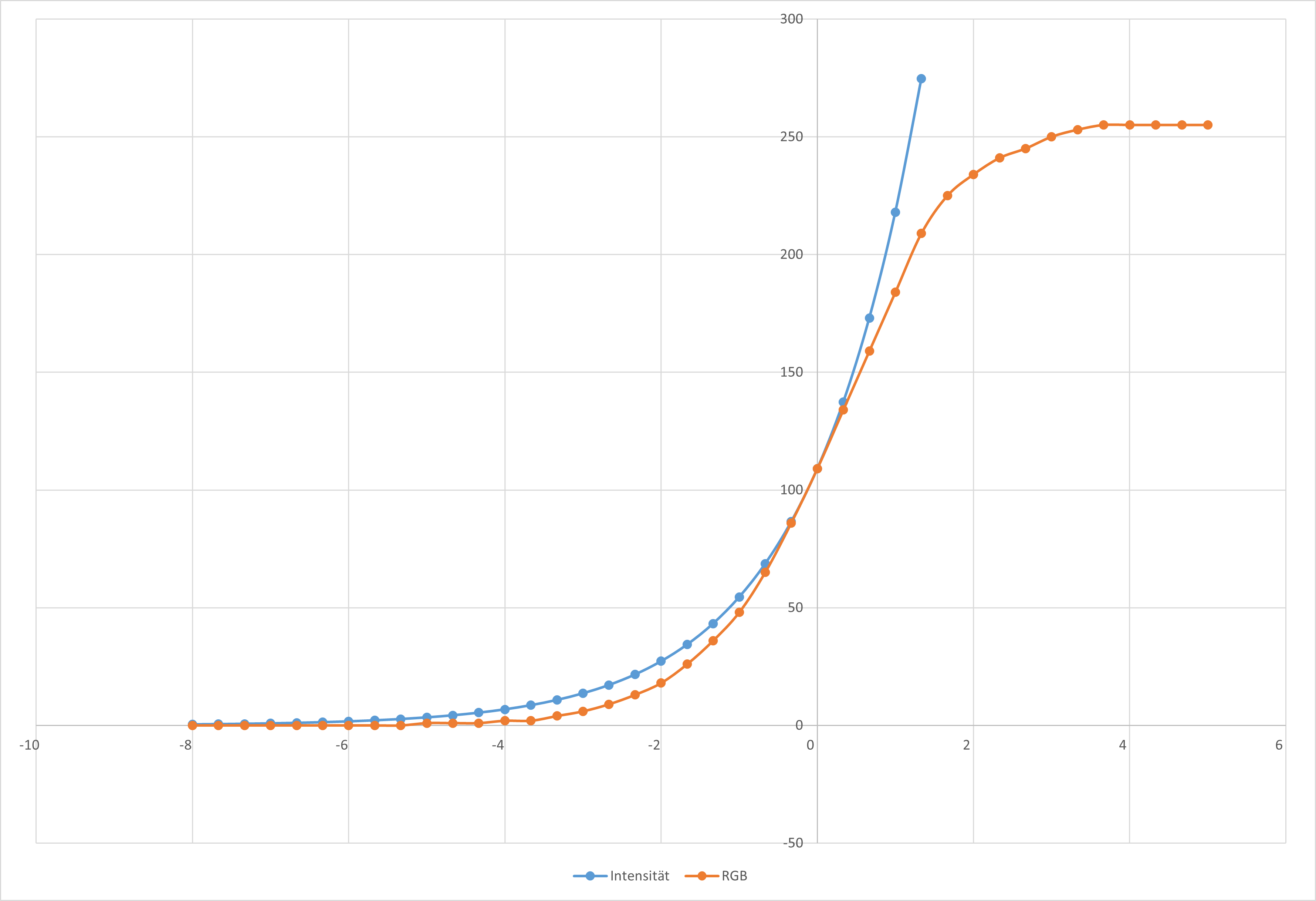
The first issue is that the relationship between the RGB values and the vignetting – measured in intensity or “EV” – is non linear. We tried to overcome this with a so called fit-function that maps the EV values to the RGB values. For that we took pictures of an evenly lit surface with varying exposure (EV) and compared those changes in exposure to the corresponding RGB values.
Then we discovered another issue, depending on the overall brightness in the picture the tonal curve changes. So this fit-function was only usable for a certain (and too small) dynamic range. The following graph shows the evaluation of 9 pictures which are all 1/3 EV apart.
The follow up issue was that even when trying to stay within this range the EV values in these graphs gave out values very different from those we derived with our previous method or could find elsewhere.
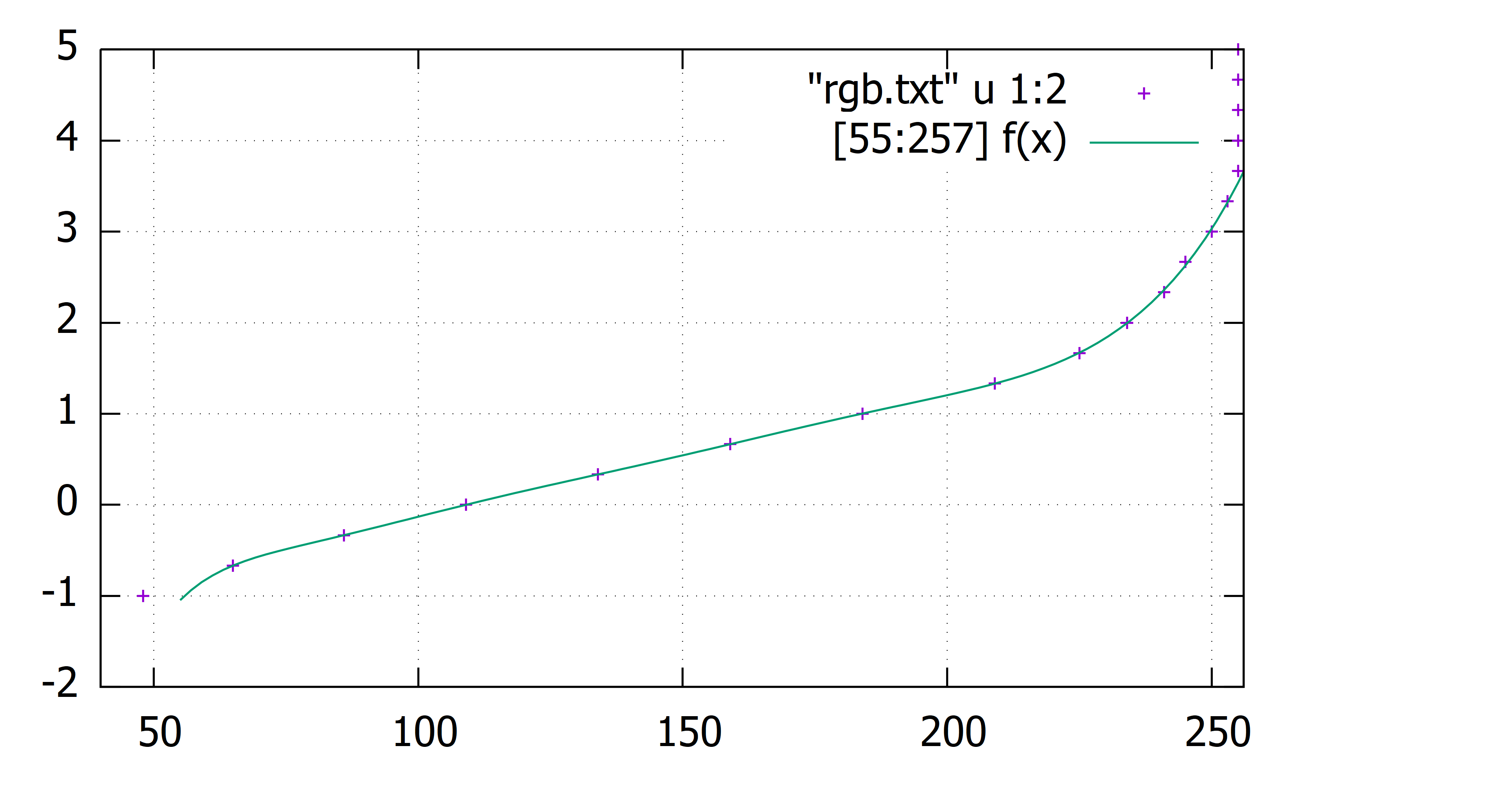
I will use the Sony FE 85mm 1.4 GM as an example. At f/1.4 I measure 2.2 EV vignetting in the extreme corner (I use the Raw file with Adobe Standard processing). Lenstip measured a mean value across all 4 corners of 2.26 EV (Lenstip is using OOC jpegs), these values are very much comparable.
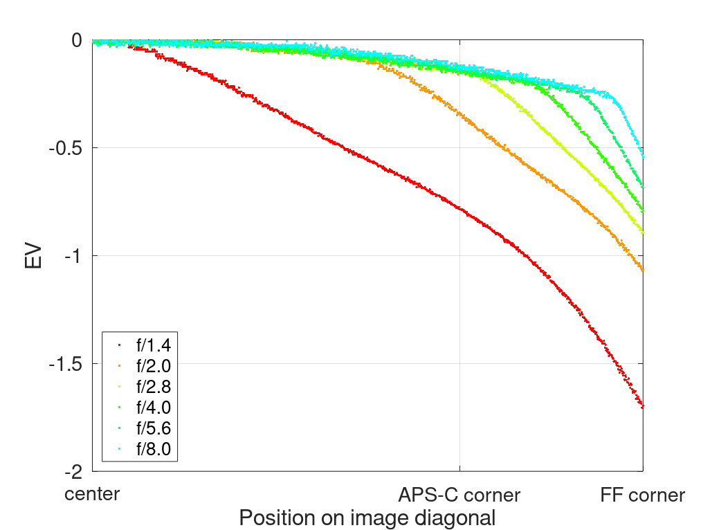
When using the aforementiond fit-function it gives out a value of 1.7 EV (see graph above) which is too big of a departure from the other values for me to publish it.
The “Solution”

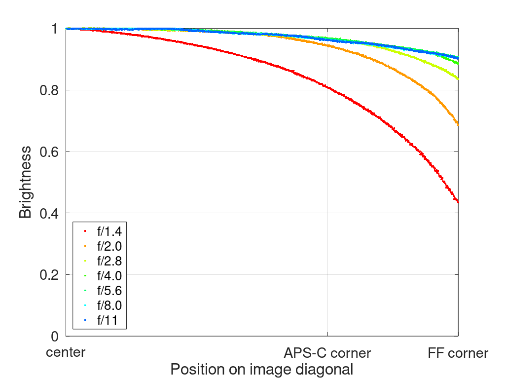
So what I will show you instead is a graph which I will call “brightness”. This is a rather unscientific name that Lenstip is also using for a similar graph in some of their reviews, e.g. that of the Sony FE 85mm 1.4 GM.
This brightness graph is merely based on the RGB values and not to be mistaken with the light intensity graphs you find e.g. in Zeiss or Leica datasheets.
How does it work? The script is simply getting the red values along the diagonal and normalizing them, so an RGB value of 0 becomes a brightness value of 0 and an RGB value of 255 becomes a brightness value of 1. All the lines for different apertures are adjusted, so that the maximum value (to be found in the center of the frame) is always equal to 1.
At this point it shall also be noted: Zeiss and Leica are giving vignetting values for the lens alone, when we measure such things (or try to) we always measure the system which consists of lens, sensor, in camera processing and post processing (like raw development). We try to keep these effects as small as possible, still what we measure will always be higher than the values that manufacturers give for the lens alone.
What our graphs cannot do:
- You cannot calculate the actual vignetting in EV by using these graphs
- You cannot compare these “brightness” graphs to the light intensity graphs in Zeiss/Leica lens datasheets
- When comparing the graphs of different lenses here on this blog you cannot evaluate small numerical differences of the vignetting figures
What our graphs can do:
- You can easily see if a lens has high or low vignetting
- You can see if and how the vignetting changes on stopping the lens down
- You can see if a lens shows very odd vignetting behaviour
Examples
In this section I will show you a few graphs to see what kind of information we can get from them.
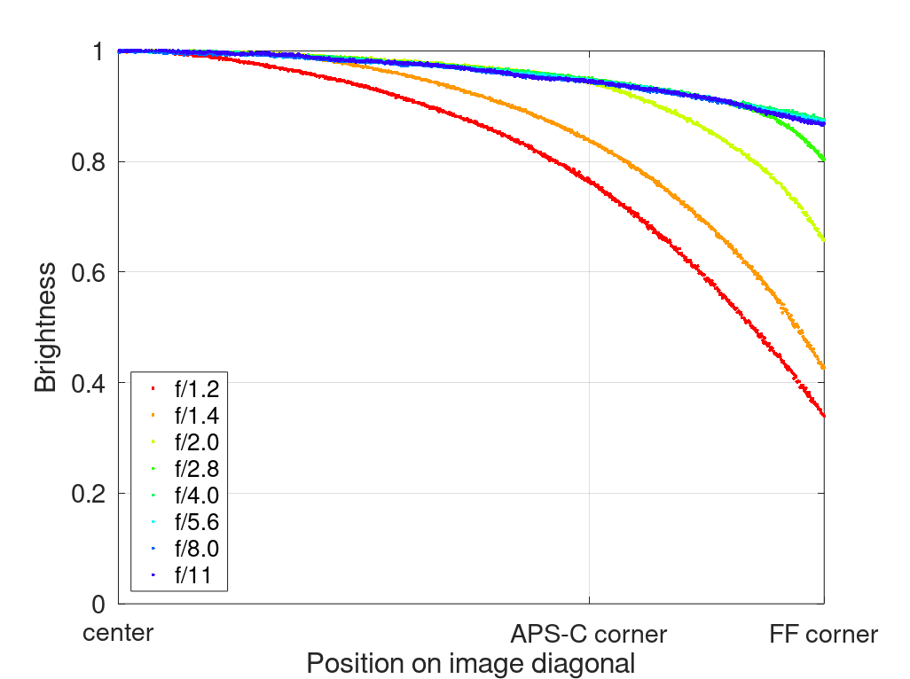
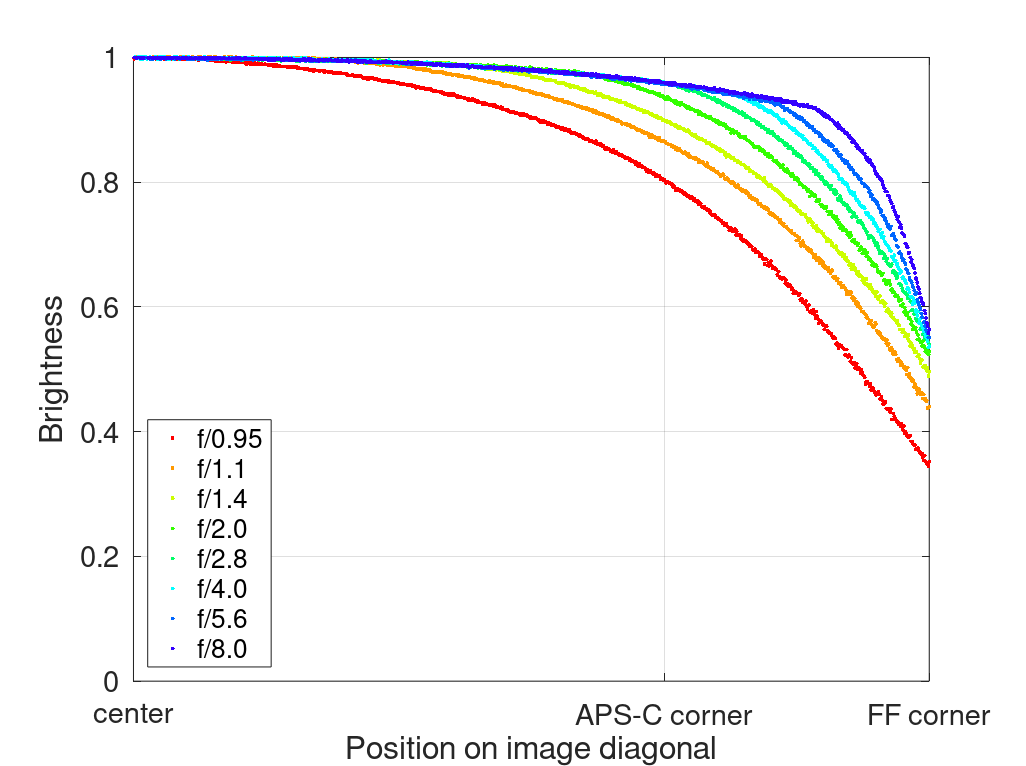
This graph of the Sigma 35mm 1.4 Art (old DSLR version) is a very typical one. We see high vignetting at f/1.4 that improves a lot on stopping down one or two stops, but as soon as you reach f/4.0 stopping down further does not make much of a difference anymore.
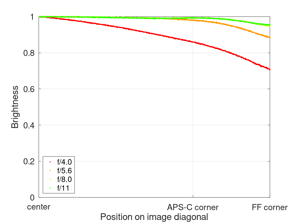
The TTArtisan 28mm 5.6 is a rather slow and very compact lens. You can see that there is noticeable vignetting at f/5.6 that barely improves on stopping down.
The TTArtisan 50mm 0.95 M is one of those lenses where the vignetting generally improves on stopping down, but the corners are already at the maximum possible illumination at f/2.8 and do not improve further.
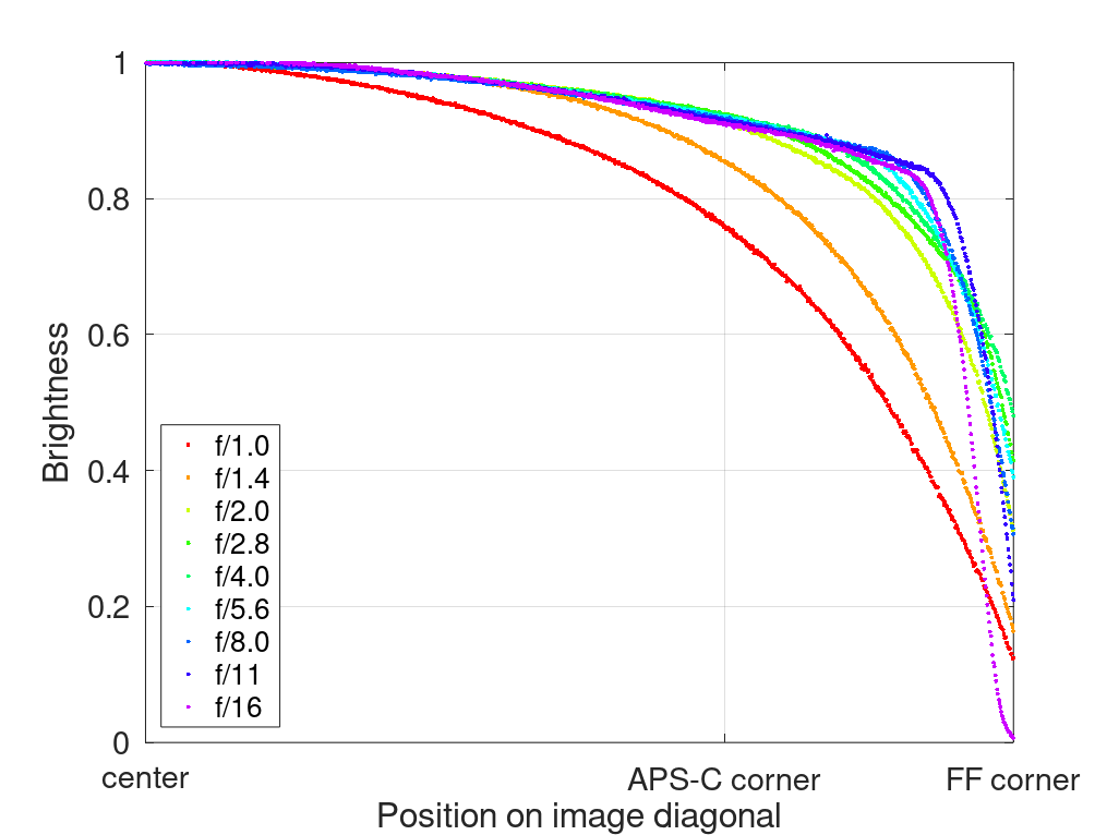
The MS-Optics 50mm 1.0 ISM falls in the “odd” category. We see very high vignetting at wider apertures but we also see that at f/16 the corners turn pitch black as I have also shown in my review.
Conclusion
As outlined in this article there are some notable restrictions that come with these graphs, but I still think they are able to tell us some useful things when evaluating and comparing different lenses. If you have any further questions you are as always welcome to ask them in the comment section, I will try to answer them.
Also: keep the things explained in this article in mind when using these graphs in internet discussions.
Big thanks to Clemens who did the programming work here. And maybe take a moment to check out some of his very appealing landscape work here.
Further Reading
Support Us
Did you find this article useful or just liked reading it? Treat us to a coffee!
![]()
![]()
![]() via Paypal
via Paypal
Latest posts by BastianK (see all)
- Review: Nikon Nikkor 50mm 1.2 Ai-s - July 4, 2026
- Analogue Adventures – Part 54: Kodak Ektar 25 (expired) C-41 - July 1, 2026
- Review: Sigma 14mm 1.8 DG Art - June 27, 2026
As far as I know, in lenstip’, 50% brightness= -2EV instead of the usual -1EV, so all the vignetting EVs should be halved. This is probably due to the gamma being set to 0.5 in the imatest.
Great work! These graphs are an easy way of understanding the vignetting behavior. Much more informative than just wide open visualization and a few EV values from the extreme corners.
One thing I am wondering is how you will “treat” telephoto lenses where vignetting is quite even across the frame, but overall exposure doesn’t change as much as it should when you close the aperture down one stop. For instance both Sigma Macro 400mm f/5.6 HSM and Voigtländer 180mm f/4 SL appears to have very mild vignetting since they don’t have dark corners wide open, but there is only about 1/3 or 1/2 stop in exposure difference between wide open and one stop down. What will this behavior look like in your graphs?
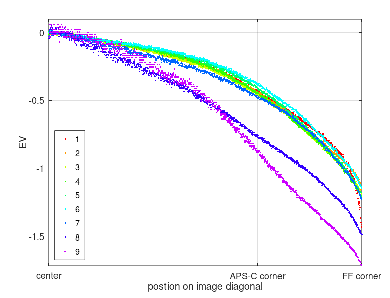
For the Voigtländer 180mm 4.0 will look like this:
Thanks. So the vignetting graphs will only show relative light loss across the frame.
I love it… These graphs will be extremely informative in helping with lens decisions. Thanks for all the great work!
Nice to see real data on this topic! It seems to me that some lenses have a color cast change toward the edges of the field – a very unpleasant aberration. You could use the same analysis approach, showing separate RGB curves to show this in a quantitative manner.
Also – Green is often cited as a dominant color for our vision. It’s also between Red and Blue in the spectrum. Why use Red for this analysis?
I am actually using files converted to B&W now for other reasons, so it doesn’t really matter anymore which color the script is getting.
That will work great for average vignetting. I was hoping to also see color variation across the image, as well. I had a lens that needed a radially adjusted color correction. I can’t recall which one now. Hopefully this is uncommon…
Nice article and also nice photography by Clemens. I’m curious about what’s going on between the photon counting and the RGB values – it looks like there’s highlight compression dependent on global brightness and gamma not equal to 1 (as noted by Gorden – near to 0.5). Are the RGB values not taken from the raw file data?
Thank you!
The data is taken from jpegs exported from Lightroom using Adobe Standard processing.
It is much less convenient to use raw data (demosaicing, proprietary file formats, lack of native support in common programming languages (here: MATLAB/Octave)).
I´m not a professional programmer.
I have compared the graphs from the Laowa Argus 35mm and 45mm and expected to see a noticeable difference in favor of the 35mm, since I remember from your reviews that the 35mm has markedly less optical vignetting (cats eye) in the outer mid-frame and corners.
However, the graphs look almost the same, while the 45mm show _less_ vignetting in the mid-frame in both graph and light fall-off images.
At first, I didn’t understand why this could be the case, but thinking about it, it may be caused by the 35mm having a shorter exit pupil which leads to more natural and pixel vignetting.