How to take better photos?

Most of you are here for lens reviews and other articles covering gear but we think it is only responsible to look beyond gear from time to time, since your skills as a photographer are much more important in the end. In this article Bastian describes his most often used composition techniques and we hope that you can get some inspiration from them to improve your own photography skills.
Part I: Composition
In this part I will try to show you a few composition techniques that I regularly use.
Repertoire
These are some techniques I regularly use, some of them can also be combined for enhanced effect. They have become my “repertoire” and I often look for possibilities to use them in the field.
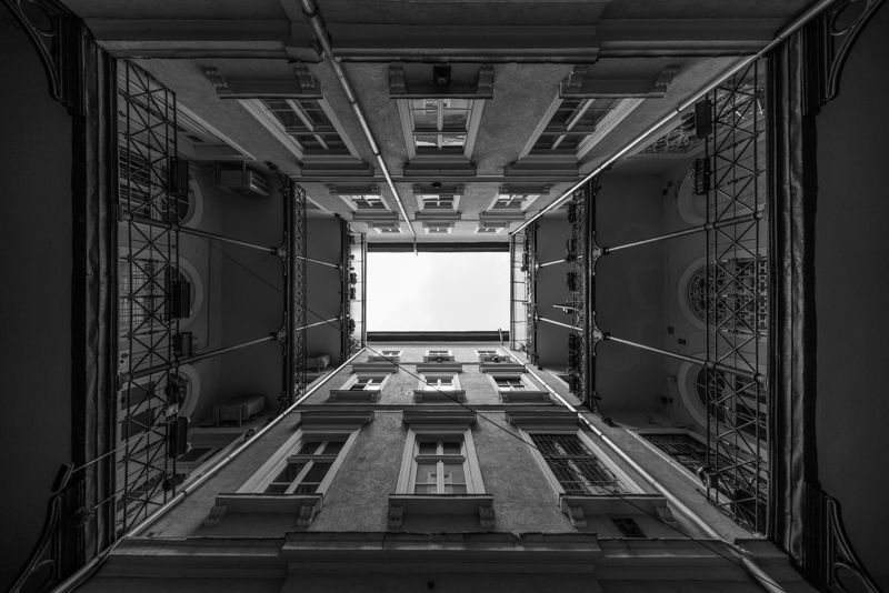
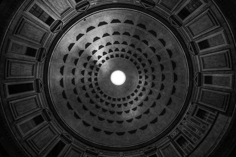
Symmetry
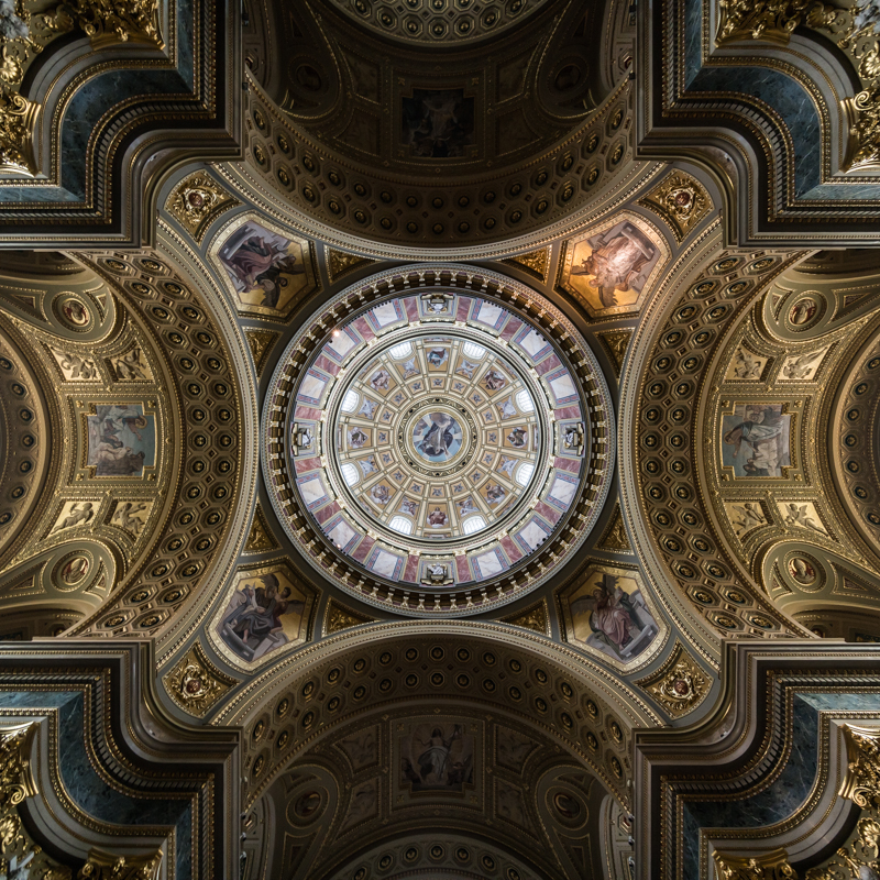
A clever use of symmetry can yield very interesting shots. You need to be very careful here though, if your alignment is somewhat off and the viewer notices this the image will loose its visual impact.
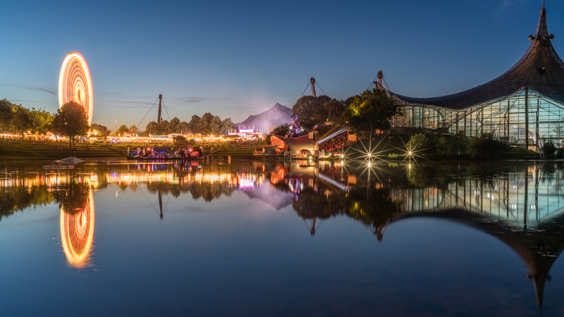
Reflections

Reflections are often a subtype of Symmetry but nevertheless worth mentioning. I even dedicated them a whole album.
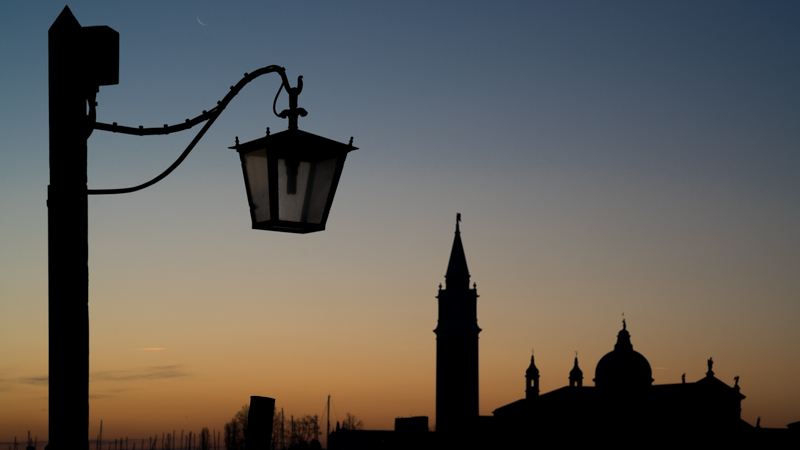
Silhouettes
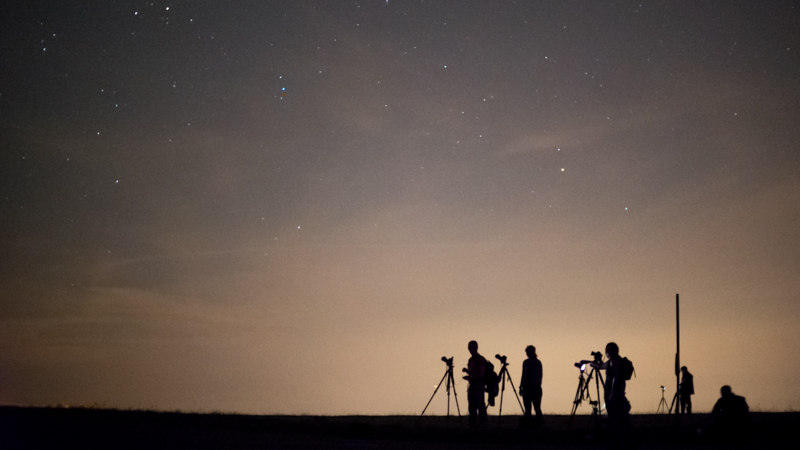
Unfortunately many people think every photo needs to be an HDR nowadays and try to avoid black or white areas by all means. But sometimes a silhouette, especially with black foreground and colorful background, can yield the more striking image as contrast will be much higher and the shapes will draw more interest.
Sunstars
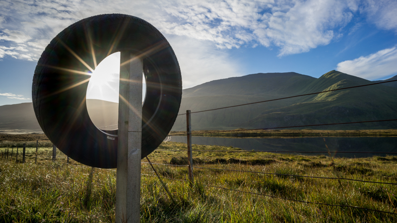
With a low sun or strong point light sources at night you can also try creating a sunstar somewhere in the frame as an additional point of interest. You might want to have a look at this article for further reference.

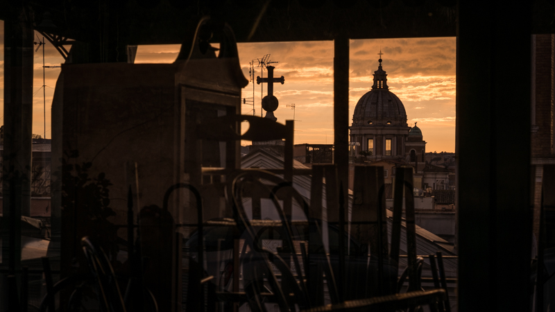
Framing

Framing in terms of composition means creating a frame for your subject in the picture. This is not a technique I use very often, but still there are certain situations this can be used for nice visual impact or just creating depth.
Converging verticals
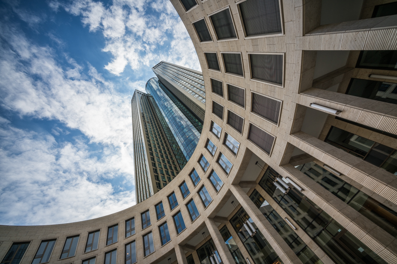
In architecture I often despise converging lines and will try to avoid or correct them in post. Nevertheless if used correctly they can also exaggerate the size of buildings and improve the composition.

Geometric Shapes

Try looking for geometrical shapes: rectangles, squares, circles, triangles. Keep it simple!
Juxtaposition

Bringing things together in photos that are rarely seen together can also yield interesting photos. You need to watch out to not make it look too staged though.
Further things to think about
Golden ratio / Rule of thirds

You have probaly all heard of this one. It suggests placing your subjects in the thirds of the frame to archieve a harmonic composition. In general I tend to agree and you will see many of my photos that follow this rule, but you will also find quite a few where I placed the subject right in the center of the frame and it adds to the image.

So, neither stick to this rule nor ignore it, but give thought to the placement of your subject in the frame.
Layers
I am not talking about layers in Photoshop here but about layers in your images. For example the background is a layer, the foreground is a layer and there might be one or more in between. More often than not more layers will make your photos more interesting to look at as they help to create depth. I will try to explain this by the following two shots:

This is what I tend to call “the tourist shot”. Shot from eye level, subject right in the middle and despite having some nice clouds in the background rather flat.

This on the other hand is a composition with a little more thought behind it. The old tree stump does not only add another layer but also balances the rock that is now pushed a bit into the background. The eyes now switch all the time between the rock and the tree stump making the shot much more interesting to look at.
This is another example:

This shot already looks very harmonic (see “Symmetry” and “Reflections”) but it is rather flat and lacks some depth.
The tree under water in the foreground does not only add another layer, but significantly increases the sense of depth in the photo, which leads to a more interesting shot to look at.
In or out


With people, animals, plants, cars it has a huge influence whether they are oriented towards the frame or away from it. In most situations I vastly prefer having things moving or looking inside the frame, but sometimes also the opposite makes sense, depending on what mood you want to convey.
Final words
Please tell us in the comment section if you like these kind of articles so we can decide if it is worth continuing this series. Thank you!
Other Articles
- Tripods for mirrorless cameras
- Overview: Lens Reviews
- User-Guide to wide-angle lenses for Sony a7 a7II a7rII
Support Us
Did you find this article useful or just liked reading it? Treat us to a coffee!
![]()
![]()
![]() via Paypal
via Paypal
This site contains affiliate links. If you make a purchase using any of the links marked as affiliate links, I may receive a small commission at no additional cost to you. This helps support the creation of future content.
Latest posts by BastianK (see all)
- Review: Sigma 85mm 1.4 EX DG HSM - July 22, 2026
- Review: Mandler 35mm 2.0 7e - July 18, 2026
- Review: Viltrox AF 26mm 2.8 Evo FE - July 15, 2026
Bonjour,
Think this will become an endless discussion. I like this…, I don’t like that.
So many articles like this. If rules get fixed well never see a new thing.
About rule of thirds, that’s not the golden ratio A:B=B:(A+B) ~0,618
Hi Bastian,
I would like to see more articles like this one every now and then. It is always interesting to see how other photographers create their images!
I especially like how you use symmetry in your architectural shots. This is something I try to do too for my architecture shots. Placing the camera exactly in the right position is always a struggle though, do you have some tricks to make this easier?
Kind regards,
Juriaan
Hi Juriaan,
Yes, it always is a struggle, especially in crowded places where you can’t properly set up a camera with tripod (churches, stations and so on).
I am using the 6×4 grid framelines and try to balance the top middle and bottom middle first, after that left and right middle.
Almost always I end up doing final minor adjustments with the upright tool in Lightroom though.
Hi Bastian,
Thank you for your reply! That is more or less the same method I use.
Thanks ! Photography is not only about gear… Nice to talk about the actual process of taking pictures. That’s why we bother about using and learning gear in the first place !
What about PASSION?
Art is about thrill, telling an story, love, beauty, hate, emotions.
Many people are not able to fall in love if its lover is absolutely flawless.
When a photograph is just perfect, it becomes a photocopy of reality, not else.
Best tools and best skills mean nothing if you do not have a task.
Hi,
in deed, I like your site, its clear presentation, and the profound contributions of all of you. I even bought some legacy lenses, you used, discussed and recommended. As I have already plenty enough lenses – contemporary and legacy ones – for my mirrorless Sony and Olympus systems, I looked still interested but more or less half-heartedly on every of your newer presentations. Gear-accumulation is one nice thing, but an equally or more revealing thing might be in my opinion to use the treasures and improve ones skills, taking really good, attractive pictures with the gear at hand. (But that’s you also want, of course.)
Looking at all of your pictures, presented as examples so far in many of your contributions, convinced me, that your new proposed “dimension” of your site, could be very interesting and valuable for all.
Besides learning techniques and appropriate lens usage I always try to really SEE and IMPROVE. In this context I benefitted a lot for my photography, reading and studying and reading again the book:
Rudolf Arnheim: Art and Visual Perception, A Psychology of the Creative Eye, 1954, 1974
I wish you success in every respect, but don’t give up your gear stuff, maybe there is an interesting lens in future, I might ….
Great piece . Your help and time is greatly appreciated. Sharing your professional help is unmeasurable. God bless you
Hello, i think articles like this, even if maybe a little out of the page’s original intention, are really interesting and appreciated. Although many things mentioned are known they cannot be repeated often enough as sometimes they got lost in the heat plus, a little reflection about this is always helpful – even when developing an own approach to them!
Thank you Bastian! I really appreciate this type of articles.
Thank you for this article! I come here for the excellent lens reviews, but always find myself marveling at everyone’s pictures. The composition is always leagues above mine so I really appreciate articles such as this!
Brief and to the point. Excellent example photos to make the point. Making suggestions, giving opinions, good article. Not dictating rules. Thanks.
Thank you Bastian. I learned a lot from this article. Especially the part about silhouettes, which I put to use right away.
Glad to hear, you are invited to share the results 🙂
While I enjoy the gear aspect of photography, I really like these kind of articles as well – much appreciated, have no fear to write more such “how to” pieces! Same for the ones Philip wrote about how he creates his ‘look’, for example. I’m always keen to learn something new or to get reminded of something old and half forgotten.
Thank you all for your feedback so far, greatly appreciated!
Thank you for your wonderful article Bastian .
I am wondering, what lens did you use for the bird’s picture “in or out” ?
I looks so nice!
Thank you!
That shot was taken with the Nikon AF-S 200mm 2.0G VRI on the D800.
There are a few more from this series here.
Nice article, thank you!
I really like your site and this article was very nice, indeed!
Although there was nothing really new for me as I’ve read a few books about this topic and also some other articles, I’ve enjoyed it a lot (which was mostly due to your great illustrational photographs).
These kind of articles are definitely an enrichement for this site.
But I might have an idea which suits the style of your site even more:
You are testing lenses and go into detail about specific imagin features of different lenses.
What about writing a series of articles in which you describe how to use certain lenses with specific physical “flaws” (like spherical chromatic aberration, specific use of flare, making the best out of low-contrast lenses) to their artistic best?
That would be great and as far as I know a novum on such blogs.
It would also be great to include people photography as this topic is really enriched by the use of vintage lenses (e.g. Batis/Helios Bokeh, use of low contrast lenses) where pure sharpness is of low priority.
Keep up your great work!
Thank you for sharing your thoughts!
We are working on an article regarding optical aberrations, but I quite like your idea, so maybe we can come up with something like this.
PS: I always try to include portraits in my reviews 🙂
Great!!!
Every piece of information is valuable. Articles about composition, technical stuff (like the one about the sun star shape and Aperture blades – this was really new for me) and last but not least your reviews (old and new lenses) are greatly appreciated!
Articles about using specific lens flaws to their artistic best would be icing on the cake!
Great article and great site as well. I got to your site via FM forum. Definitely would love to read articles like this. It could serve as review for others but a great resources for newer photographers… I hope you will continue in this effort.
Thanks for sharing your knowledge and time. Will be coming back for more.
Thanks, greatly appreciated feedback!
Great article, thanks Bastian ! I especially like the method of comparison between 2 photos of the same scene taken with different composition. This article inspire me to go through some of my boring photos and think how would I take them differently.
Glad you enjoyed the article!
Thank you for your article. For me, the concept of “layer” is the most difficult to master.
Always learning ,thanks !