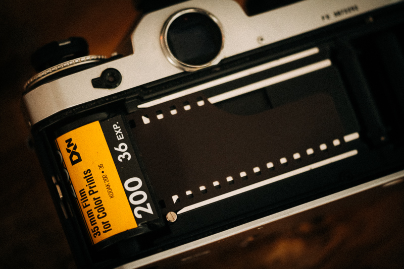
Even with the limited amount of different color negative films available these days Kodak manages to confuse the people by offering two different “low cost” ISO 200 daylight films: the Kodak Gold 200 (which I already had a look at here and here) and this Color Plus 200.
From what I gathered the Color Plus is based on older emulsion technology leading to slightly grainer and contrastier pictures, so let’s have a look at some samples.
Processing (ECN-2) and scanning was done at Silbersalz35 in Germany.



While supposed to be cheaper than Kodak Gold, these days the pricing is completely bogus because everything is always in short supply, so I think I ended up paying more for this roll of Color Plus 200 than I ever did for a roll of Gold 200.
Despite being only ISO200 I did also use it for some indoor shots with artificial light which it handled well (this might also be in part thanks to the Silbersalz processing though):



To be honest with you, I don’t see a big difference compared to Gold 200 here. Would I be willing to pay more for this than Gold 200? Nah, not really.
Considering the sparse number of films available these days I do really wonder why Kodak kept both – the Color Plus 200 and Gold 200 – in the programme, while discontinuing so many other films. Maybe the machine producing Color Plus just keeps working against all odds…







Further Reading
Support Us
Did you find this article useful or just liked reading it? Treat us to a coffee!
![]()
![]()
![]() via Paypal
via Paypal
Latest posts by BastianK (see all)
- Analogue Adventures – Part 50: What I learned from Shooting Film (so far) - March 18, 2026
- Review: 7Artisans 75mm 1.25 II - March 14, 2026
- Review: Irix 30mm 1.4 Dragonfly - March 7, 2026
It’s probably because of the ECN2 processing, but in my experience Color Plus doesn’t have the yellow tint that Gold 200 brings. That’s why I prefer it myself, it’s the slightly warmer counterpart to Fuji C200 – a perfectly decent, “cheap” (at least it used to be) everyday film. Better color fidelity than Gold 200 – again, when C41 processed – which always turns out garishly yellow to my eyes.
Oh and P.S.: that top shot is *chef’s kiss* So fun to see how much dynamic range in the highlights even consumer film has.